I currently work at Articulate, where I co-lead a platform that provides new, more efficient ways for teams to train and upskill.
Before that, I led the core learning experience team at Codecademy, and worked on tools for healthcare providers at DispatchHealth. I also built a design organization from scratch at a customer relations and payments platform called Marketing 360®. I started my career doing agency work for bespoke ecommerce websites, where I learned how to move fast while maintaining effectiveness.
Across these ventures, I’ve driven the creation and implementation of design systems to varying degrees. Each time, I worked with engineering leads to ensure that we were actually driving impact for our software development processes.
I’ve managed other designers throughout my career as well. Some of my proudest moments have been in seeing them grow to become force multipliers in their respective squads. This has taken the form of close mentorship, establishing processes, and day-to-day management.
Outside of work, I’m a husband and a dad. I ski, game, and enjoy driving. Proudly based in Fort Collins, Colorado.
Led AI adoption for an education platform, boosting engagement for over 55 million learners globally.
At a glance
Served as the lead designer throughout Codecademy's adoption of AI into the learner experience.
Introduced a skill XP feature that boosted engagement in the platform.
Used AI to create a skills taxonomy from existing courses, allowing learners to see their progress across languages and subjects. This boosted engagement by an additional 13%.
Context
Codecademy is a global edtech brand whose mission is to make coding education accessible to everyone. The product consists of interactive, web-based lessons complete with its own integrated development environment (IDE), where learners can immediately apply what they learn and see how writing a few lines of code materially changes a project.
Over its 15+ years in operation, it has amassed more than 55 million learners worldwide, and has partnered with many institutions including the White House to champion coding education for students.
“Code contains a world of possibilities — all that’s required is the curiosity and drive to learn.
A Codecademy overview video.
Scope
This case study covers two main pillars:
How the experience of learning at Codecademy evolved with AI.
How the underlying data structure for all learning content was enriched (using AI) to include learning outcomes across courses. This provided learners with a more comprehensive way of tracking progress.
I was the lead designer for the team, and I worked directly with a staff PM, a large engineering team, and a senior curriculum expert. I also oversaw and helped manage the work of 2 other designers in adjacent teams related to these initiatives.
Discovery + planning
Codecademy used Basecamp's Shape Up model. Most projects start in a similar manner: One of the team leads will spot an opportunity space, collect data about it, and present some ideas about what we can do. This is how almost all of the initiatives in this scope started.
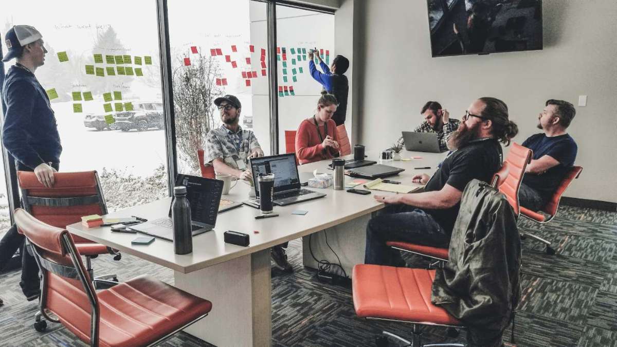
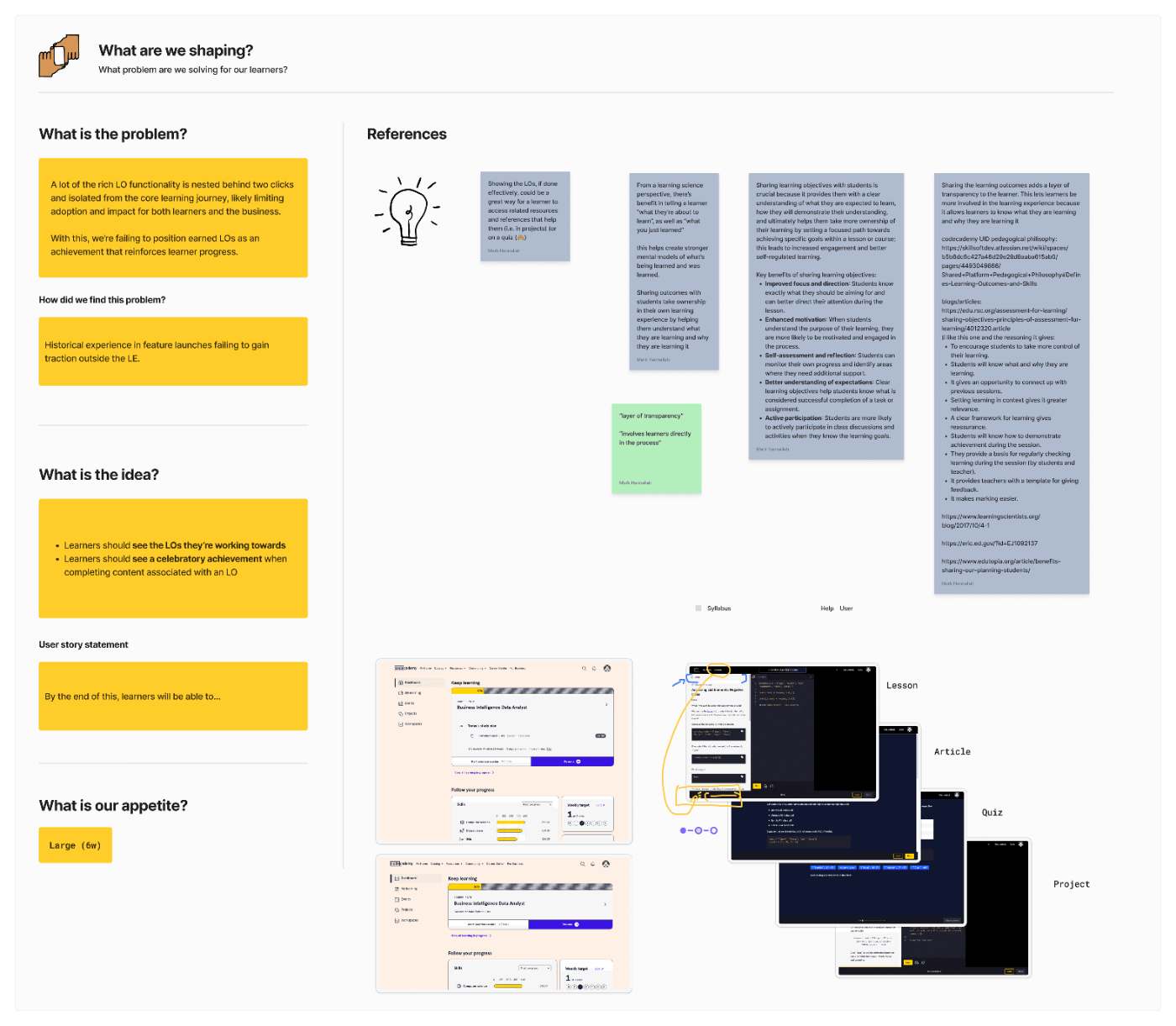
Example shaping board. Product, design, engineering, and curriculum used these sessions to define opportunities.
This way of working was highly effective for us. The team was collaborative and approached every task with the mindset of collective problem solving. This was instrumental in helping garner buy-in for our roadmap with the leadership team.
Key goals
As AI started to become more ubiquitous, we started thinking about what this would mean for computer science education. We developed the following themes through a series of shaping sessions.
Increase platform personalization. Our learners are coming to us at different points in their journey. How might we better meet them where they're at?
Experiment with AI features in ways that meaningfully benefit learners. No gimmicks.
Boost engagement by uncovering ways of making the learner journey more tangible. We heard all sorts of ways that our learners were motivating themselves — ranging from a calendar of their own, to spreadsheets that tracked what skills they had learned as they went through our curriculum. Can AI help with this?
Rapid solutioning example during a shaping session.
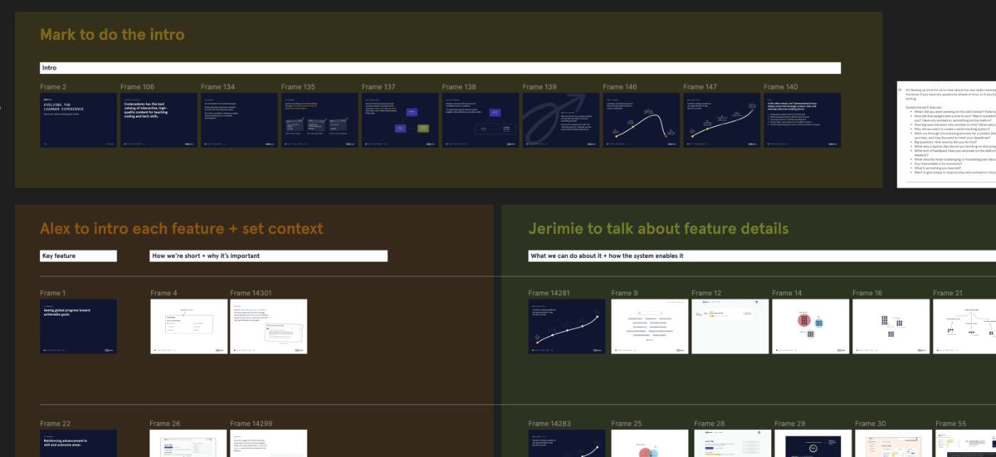
As we added definition to the strategy, we also developed messaging for the organization to share the potential new directions that we would be taking the core product to.
Snapshot of an example pitch deck.
“Our mission is to help learners gain new skills: to see meaningful skill progress, see it quickly, and retain the skills they learn.
We presented to a subset of stakeholders at a time. After each presentation, we tweaked and improved upon the messaging until we had made all the rounds and ultimately presented at a company all-hands.
The work to win buy-in paid off: the departments we'd partner with, from community to marketing and social, already knew what was coming and were excited about it.
Development
Evolving coding education with AI
There were a myriad of ideas in the beginning about how we could pull in an LLM to help improve the experience, but the team was careful to balance speed with figuring out the right thing to ensure safety and to prevent hallucinations for learners at critical points in their journey. Below is a subset of the AI-related improvements that we made. These changes, along with broader platform changes, all came together to incrementally drive up engagement and improve learner outcomes.
Enriching free response questions with AI
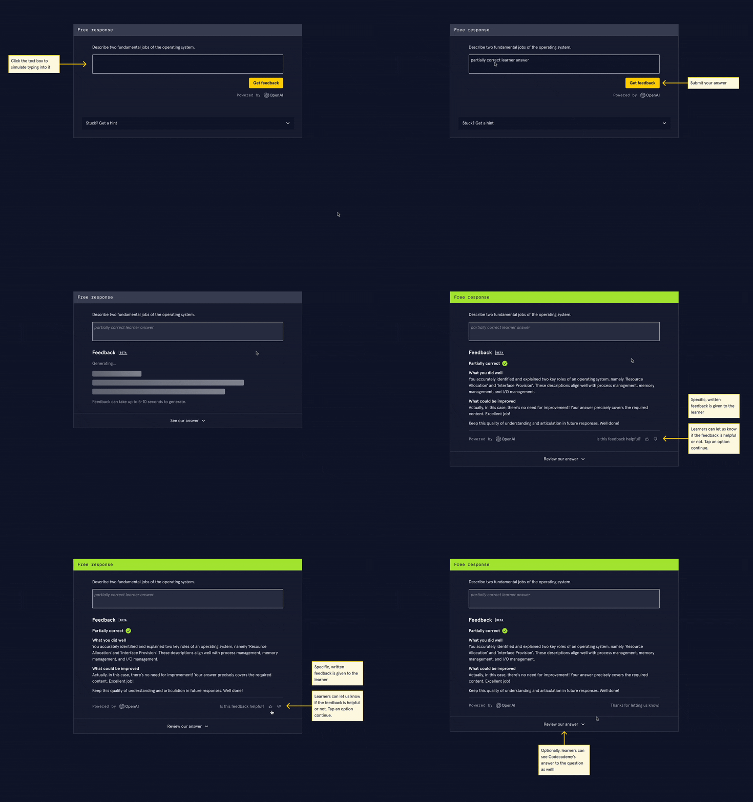
Free response questions (also known as open text responses) allow learners to reflect on material in an open-ended way. Giving feedback on these responses used to require brittle regular expressions.
This was one of the first obvious and relatively low-risk ways for us to start adopting AI, since agency stayed pretty low and the data that the model would need to respond to was limited — helping curb hallucinations.
The existing solution simply showed a static correct answer that was written ahead of time by the curriculum team. It worked, but lacked personalization.
An early concept of the AI-enabled free response question type. To keep track of the reliability of the feature, we collected feedback about the AI responses in the UI. Users also had the option of providing more in-depth comments. Each feedback entry was tied to the user and their activity so we could keep an eye on guardrail metrics.
Improving error understandability
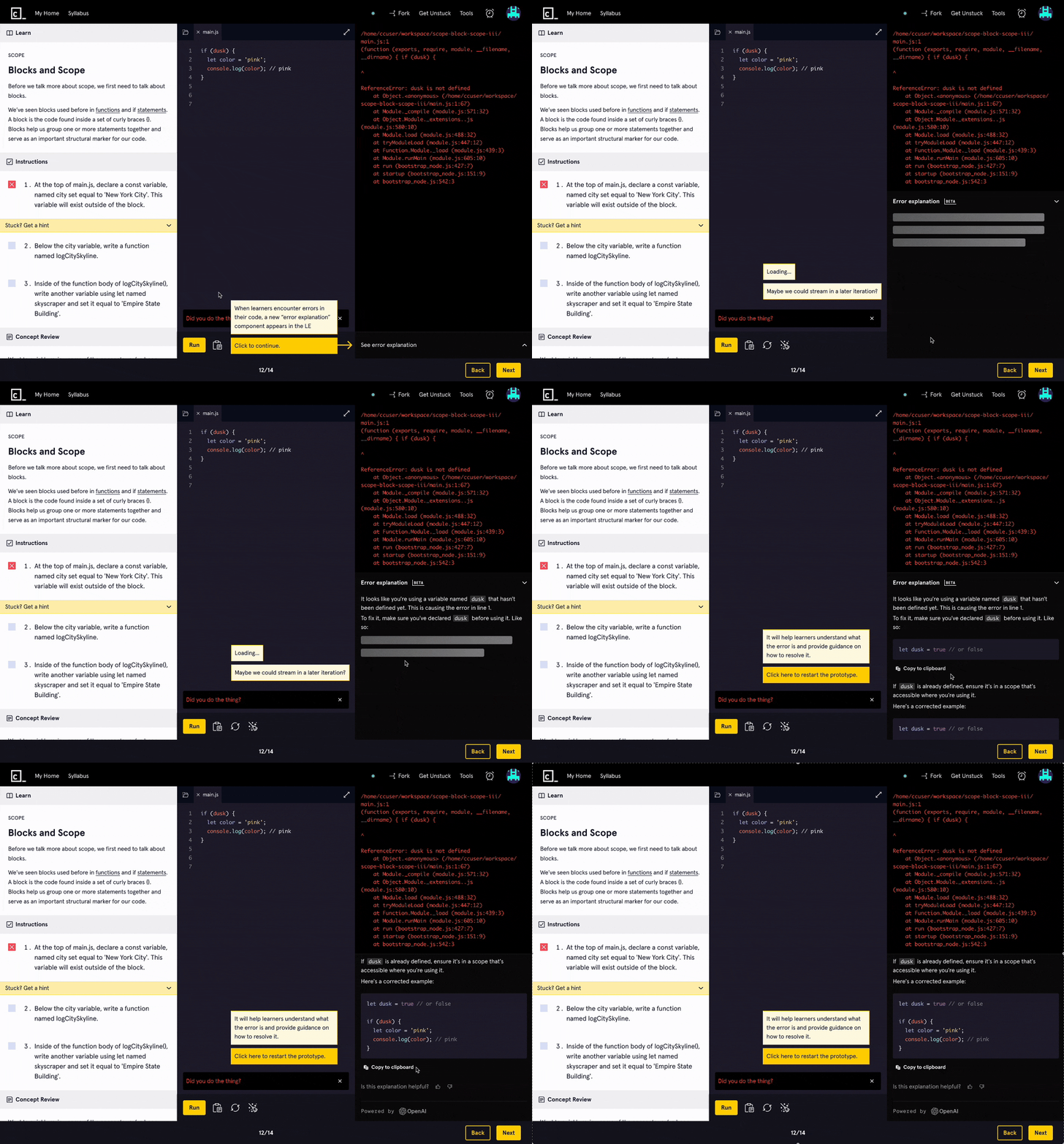
Another key experience improvement that we knew would drastically lower the barrier for new learners was to help them overcome errors. Based on our user interviews, we knew that people were already using tools like ChatGPT alongside their learning. We kept asking ourselves how we could meaningfully integrate the new capabilities offered by LLMs so that learners would not have to rely on external tools, all while removing steps in the learning journey.
Early concept of the code error explanation feature.
A note on Gamut, the design system
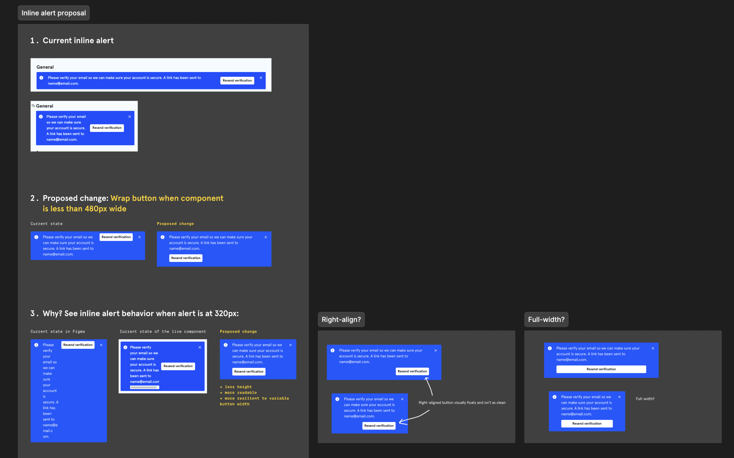
While the design system worked well on the main website, many components were too big or "loud" in the interactive learning environment. We worked with our design system team in real time to make tweaks and accommodate our use cases.
An example of the documentation made to discuss changes to components at a system level.
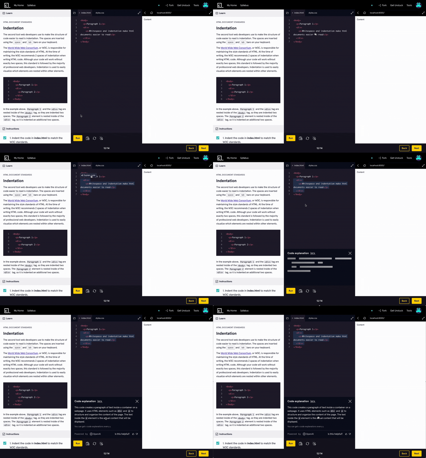
On-demand code explanations
The next improvement took it a step further. Why limit it to error explanations? Often, Codecademy lessons start with boilerplate code ranging from simple to complex. While the content breaks down what the code is doing, some learners may already have a general understanding of what's happening and may instead just have a question about a particular snippet or two.
Highlighting a piece of code in the editor allowed learners to request an AI-generated explanation of it.
Putting it all together
Once we were sure that these features had the impact that we wanted them to have, I proposed a new design pattern to unify the AI features into a simpler and cleaner experience.
Loom video detailing how we would eventually combine the different AI features.
“I started to use this platform a few years ago and I feel how it changed. Codecademy never disappoints me :)
Skill XP
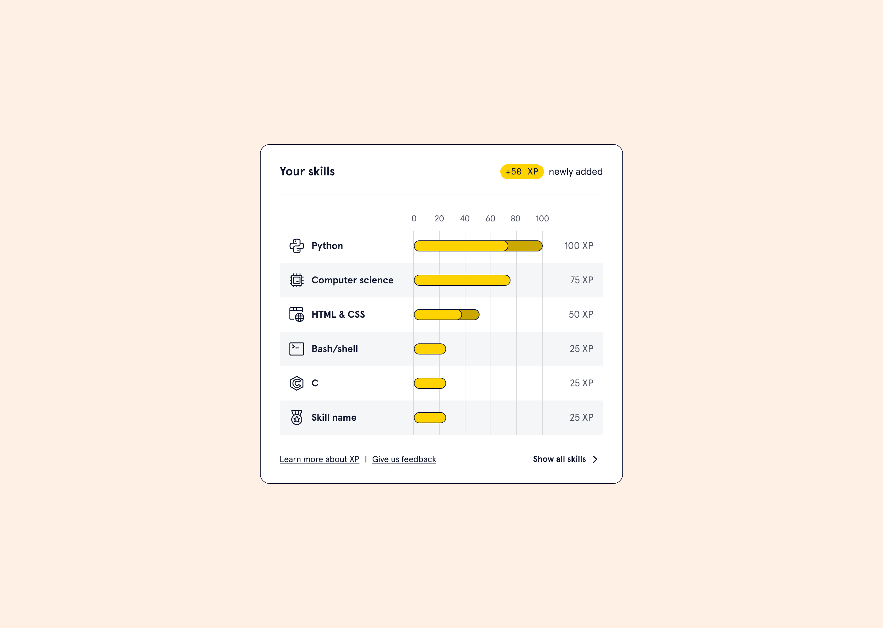
After our AI features improved CSAT, we wanted to push further on engagement. The next item on the roadmap was to make skills progress far more tangible.
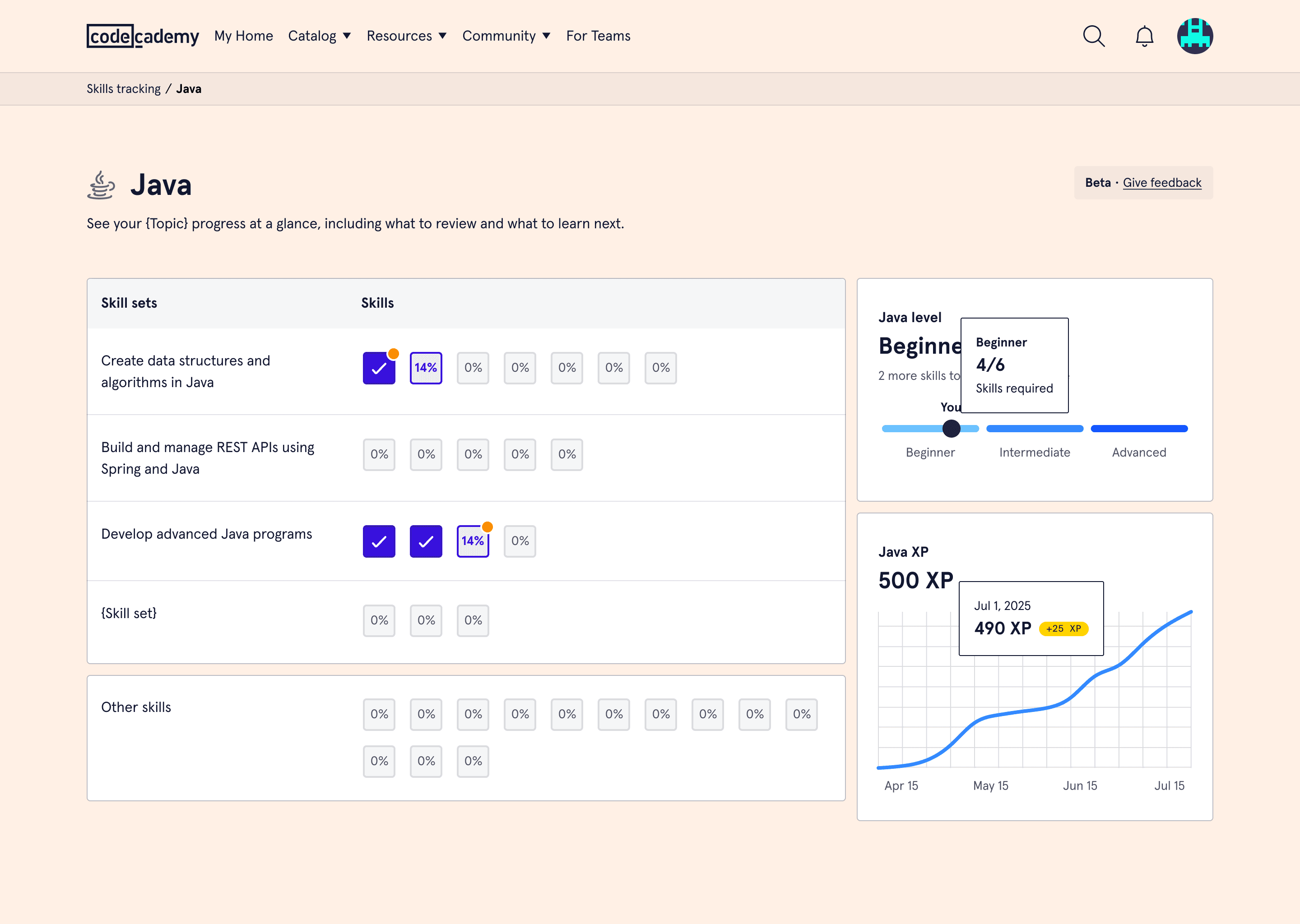
After this release, learners could start tracking their XP over a variety of languages and subjects. The UI patterns did, of course, go through rounds of critique, usability testing, and iterations with the design system team as we were introducing new data viz components.
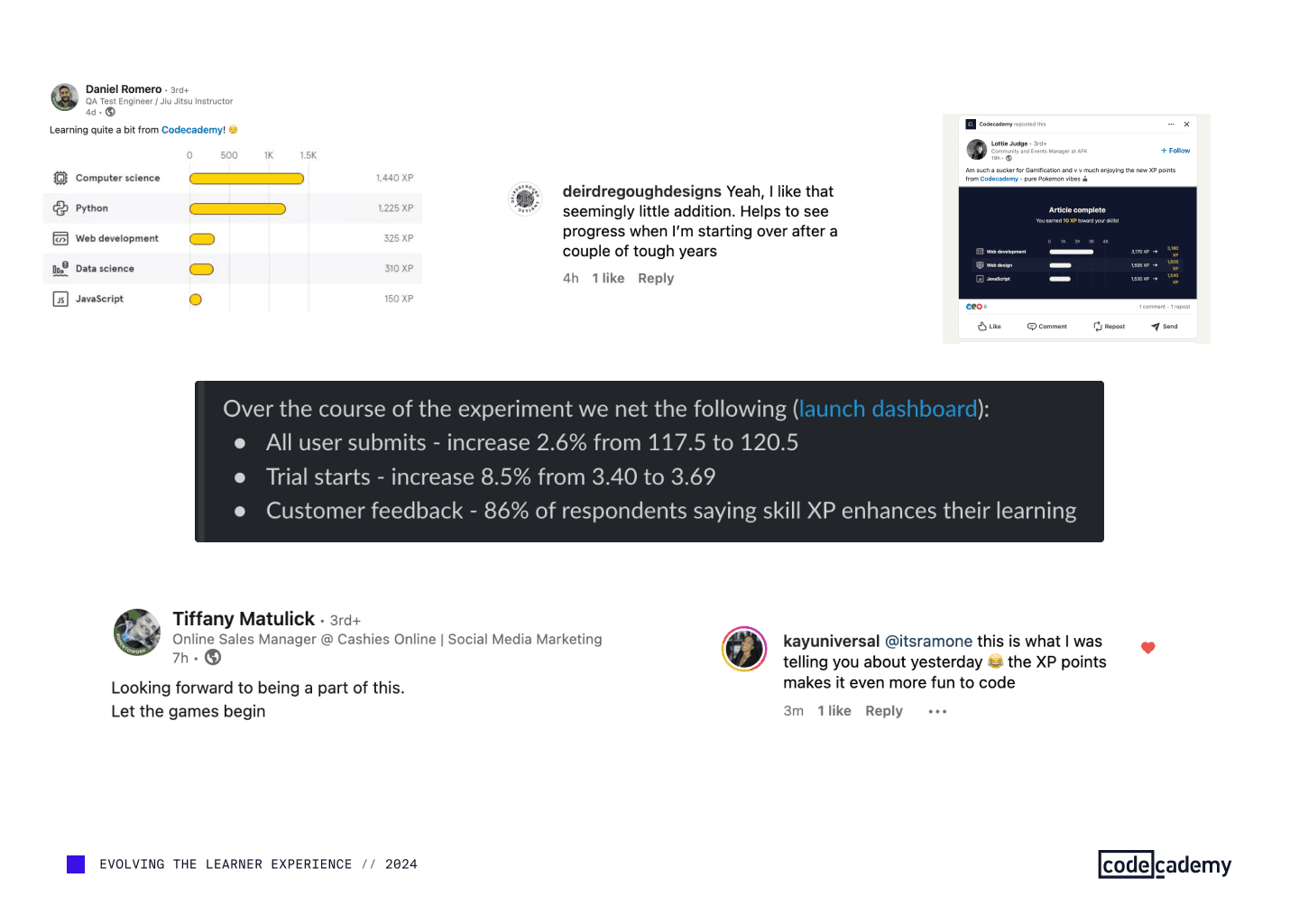
This release lifted trial conversions by almost 9%, on top of the engagement gains from earlier AI releases.
We also received rave reviews from our community members.
A snippet from an update presentation that we did as we executed on our roadmap.
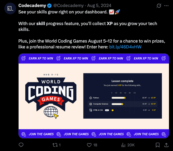
As mentioned earlier, the work we did to ensure that the rest of the organization was plugged into what we were working on energized teams across the company as well. Marketing ran a campaign challenging learners to earn the most XP in a set period. The winners had a prize, of course.
A post on X announcing the competition.
Moving from courses to skills
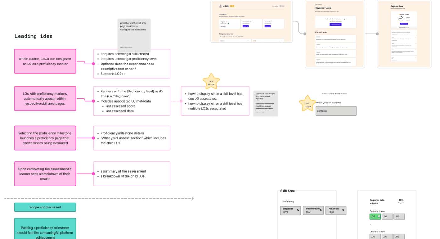
The last pillar was using AI to generate a whole new layer of metadata in our catalog.
Traditionally, in order to keep track of what they've learned, users had to parse through the courses they've taken. Skill XP improved this experience, but we wanted to do better.
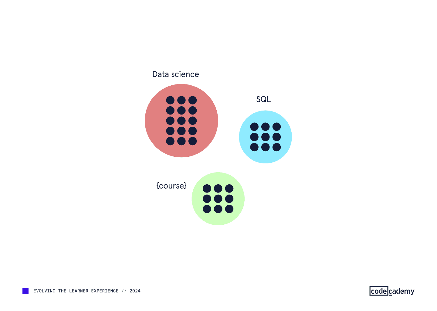
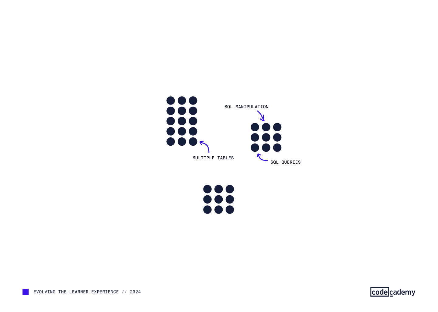
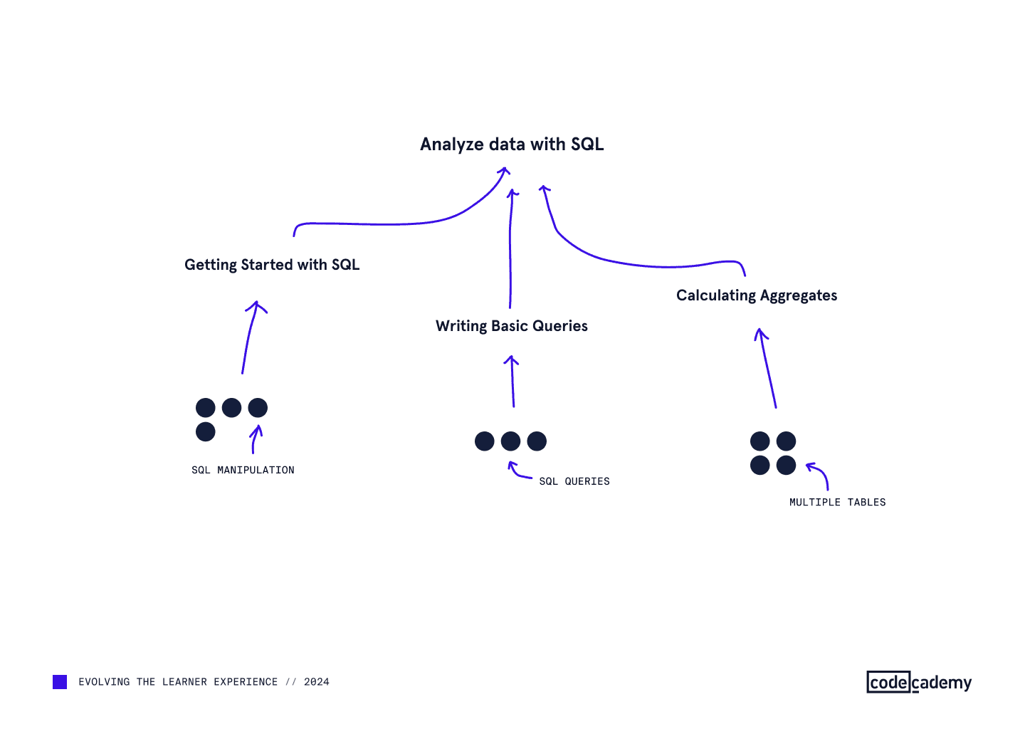
The reality is, when you learn one thing in a course such as SQL manipulation, you're also learning to calculate aggregates, write basic queries, and more. But in the UI, you would just get a checkmark saying you know basic SQL.
Courses (colored circles) taught sets of skills (dots).Example of what each of the skills could be.Visualization of how the same skill can ladder up to a variety of larger skill sets.
“While getting into the groove of learning, it would be nice to get a little positive feedback, understand the relationship between effort-in and outcomes...
We used LLMs to map the skills taught in every module of the library. This allowed us to show progress across skill sets more comprehensively, and also set the foundation for producing custom learning paths as a next step.
In the UI, the MVP release of this already showed a much richer view of our content.
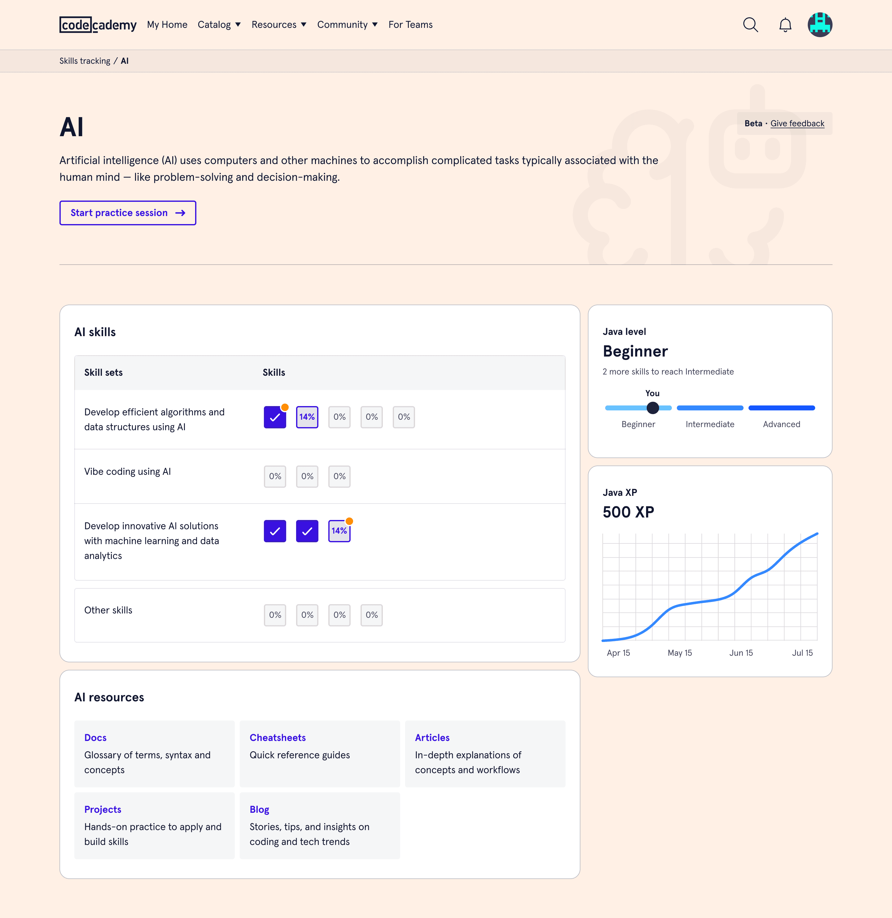
Now learners could see their progress at a high level — combining skill XP and skill progress data.A later iteration that enhanced the visuals and included more resources.
“My coding dashboard is looking good! 💪 It's rewarding to see the XP accumulate in areas I'm passionate about
This release lifted engagement by another 13%.
A note on accessibility
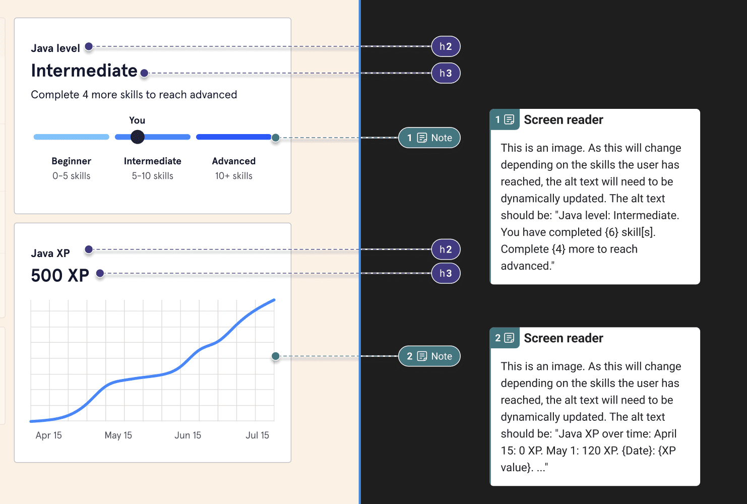
As a global product owned by a public company, we treated accessibility as a top priority. It's worth noting that these new custom data viz components went through extensive accessibility reviews.
Example of the accessibility considerations that we had on each data viz component.
Impact
The initiative gave teams across the company one roadmap and measurable gains in engagement, satisfaction, and trial conversions.
The release of the skills feature was limited to a single language at first (Java). During the experiment period, courses tagged with that language saw a massive boost in a metric tracking how much code is being interacted with by our learners.
There were two branches to go from here: Dig deeper into AI or start working on custom learning paths. As of Q4 2025, Codecademy is investing in both and has reallocated teams to build on this foundation.
Improved CRM and payments systems for small and medium-sized businesses, driving a 30% increase in GMV.
At a glance
I led a team that unified a disjointed multi-product experience into a single journey, resulting in a 30% increase in GMV.
I led the creation of a mobile app that extended the new journey to more customer types and widened its reach. The app now processes millions of dollars per month in transactions.
Created a design system and a research org from scratch, while managing a design team of 4.
Context
What is Marketing 360?
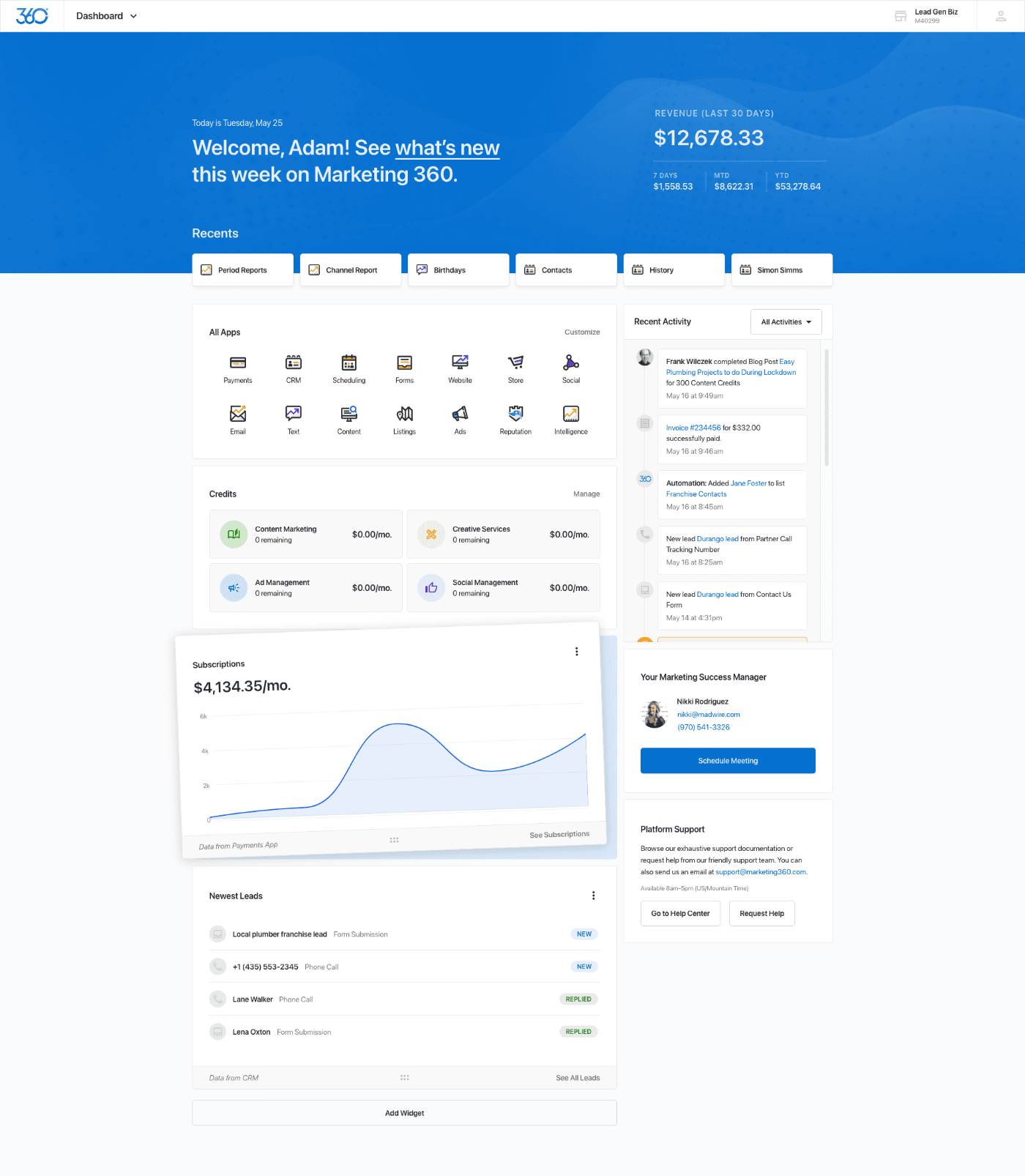
Marketing 360 is a B2B platform that allows small and medium-sized businesses (SMBs) to manage their leads, customers, payments, and more in a single place.
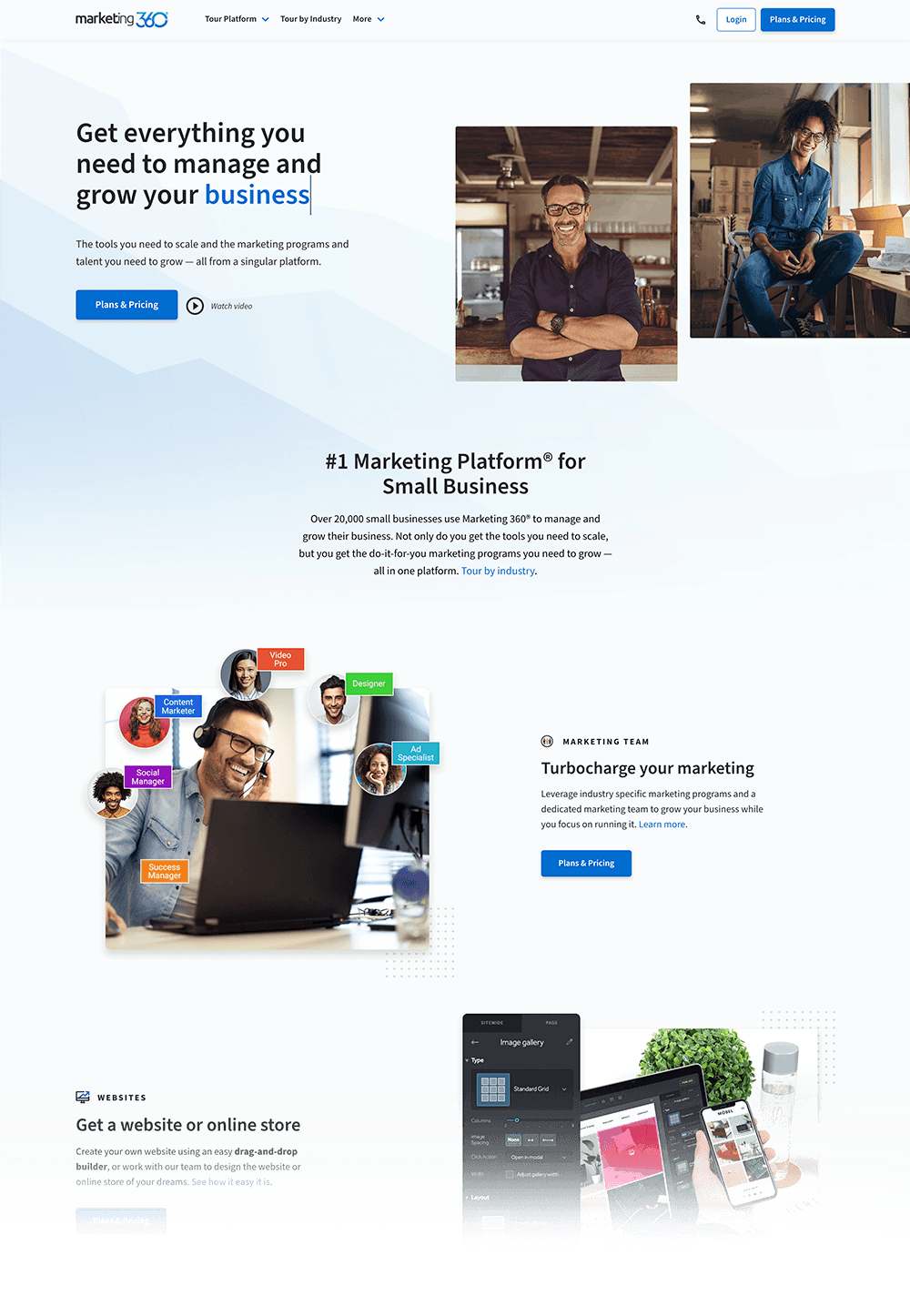
A screenshot of the Marketing 360® home page. I served as the Creative Director for the new website that launched alongside the improvements covered in this case study.
Scope
This case study focuses on improvements we made to core parts of the product that drove a positive impact for our customers and for the business. I worked directly with our executive leadership team to drive this project as the Director of Product Design. I helped shape the strategy, worked with associate designers on select surfaces, and owned much of the user journey as the primary designer.
Discovery + planning
Marketing 360 had a lot of different products within it: Ad management, social media management, SEO tools, etc. However, the pieces that most signaled stickiness in the platform were the CRM and Payments products. Knowing this, we set out to uncover insights and areas of improvement in an effort to boost adoption. We analyzed usage, transactional, and customer lifetime value data to identify key points for interventions.
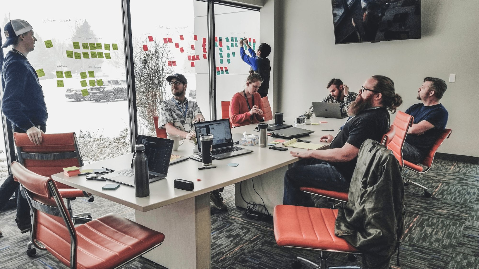
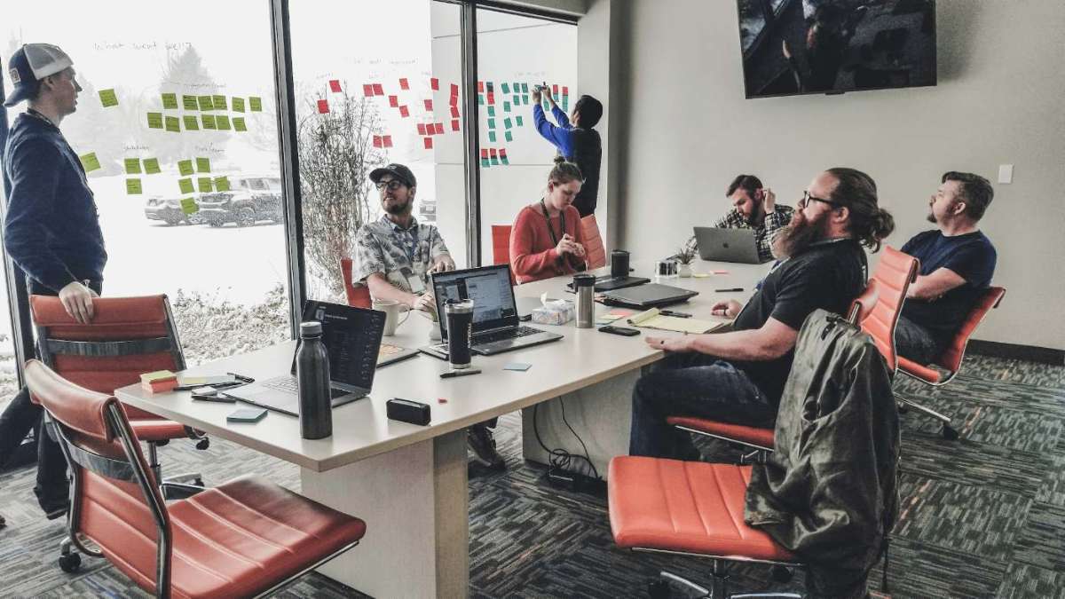
Strategy session with the product team.
While I collaborated with my product partner on parsing the quantitative information (e.g. average transaction volume per account, number of customers per business, etc.), it was on me to lead the qualitative side by driving customer interviews.
When I started in this role, Marketing 360 did not have a research organization. As a part of this project, I worked with senior leadership to establish an incentive for businesses (customers) that would sit with us to provide insights about their day-to-day. To do this, I wrote up a 1-page proposal asking if our team could be granted the ability to add "credits" into customer accounts based on the time they spend with us during research. Leadership saw the value in this and gave us the green light.
I sent a survey to 150 businesses and used the responses to find people who were most representative of two target groups: customers who were using the CRM and Payments products, and businesses who weren't. We recruited across multiple different verticals since different industries have different needs.
I worked with our engineering and product leads to develop questions that revolved around their day-to-day to surface insights on their interactions with their customers and any other tools that they may have been using on top of Marketing 360®. We analyzed these competitors, compiled our findings, and presented them to the business to garner buy-in and calibrate our understanding.
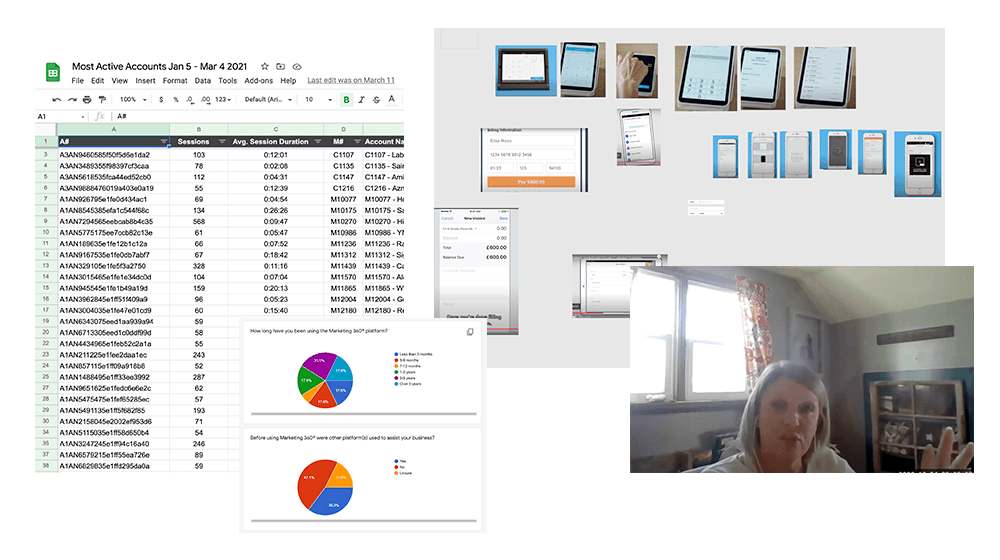
A sample of user research and market analysis on existing tools.
What we learned
We confirmed the correlation between usage of our Payments app and one of our key metrics: churn. The more our clients used Payments, the less likely they were to leave.
Lead management in the platform was difficult. The "leads inbox" feature lived in a part of the product that was completely separate from the CRM and the Payments workflows, leading to a disconnected experience where business owners had to constantly go between different apps to get something done.
We weren't serving mobile-first SMBs effectively. Customers like contractors or mobile merchants faced a lot of friction in using our applications because they weren't designed for smartphones.
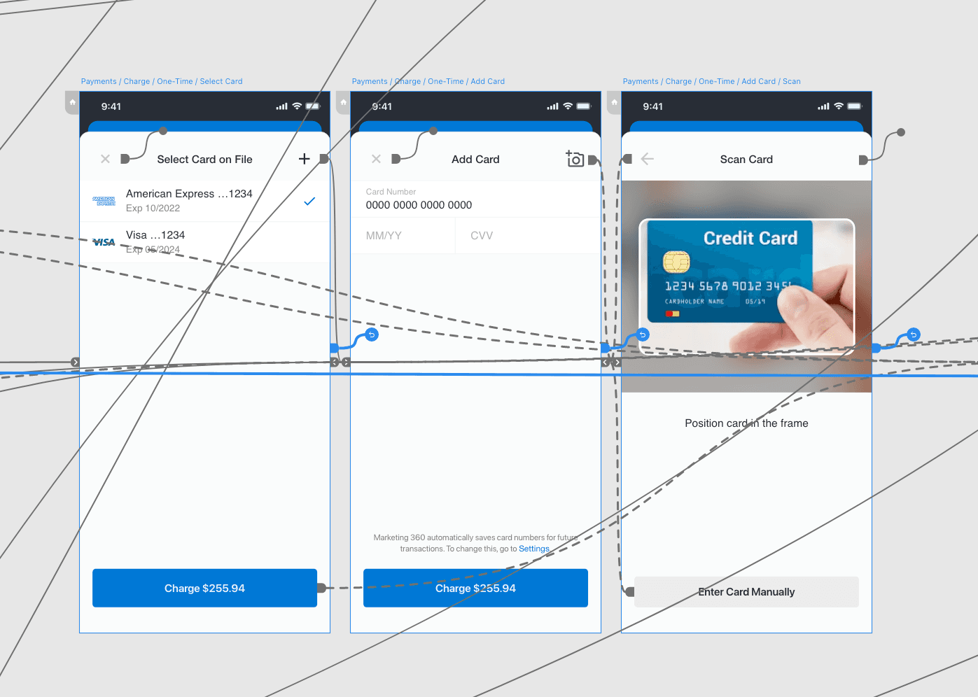
Payments also made business owners type in payment details instead of using modern point-of-sale options.
Making it actionable
Our findings were presented in a series of small meetings, leading up to a larger product org-wide digest. Clips of our customers talking about their challenges alongside the quantitative metrics we uncovered painted a compelling narrative that allowed us to get the buy-in to get a project resourced and proceed.
We chose gross merchandise value (GMV) as our north star because transaction volume was a leading indicator. This data was real-time and directly tied to our revenue since our platform made a profit for every transaction that it processed.
Development
How did we decide which problems to tackle first? We needed to think about a proper roadmap with opportunities to validate our approach along the way.
For instance, solving the point-of-sale problem could be a great place to start, but the reach would be limited by the volume of accounts who were actually using the CRM product. Further, the CRM is limited by how effective the lead management system is to begin with. Not to mention a point-of-sale solution could be drastically more complex considering we use a third-party provider to actually handle transactions on top of potential hardware implications.
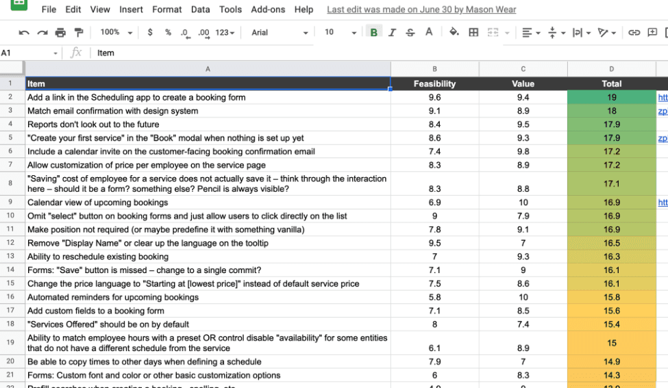
Across many strategy sessions, we used priority matrices to agree on a path forward.
Example priority matrix from another part of the product. Design, PM, and engineering would sit together to approximate the values for our effort/impact matrices.
Solutions
Improving the leads inbox workflow
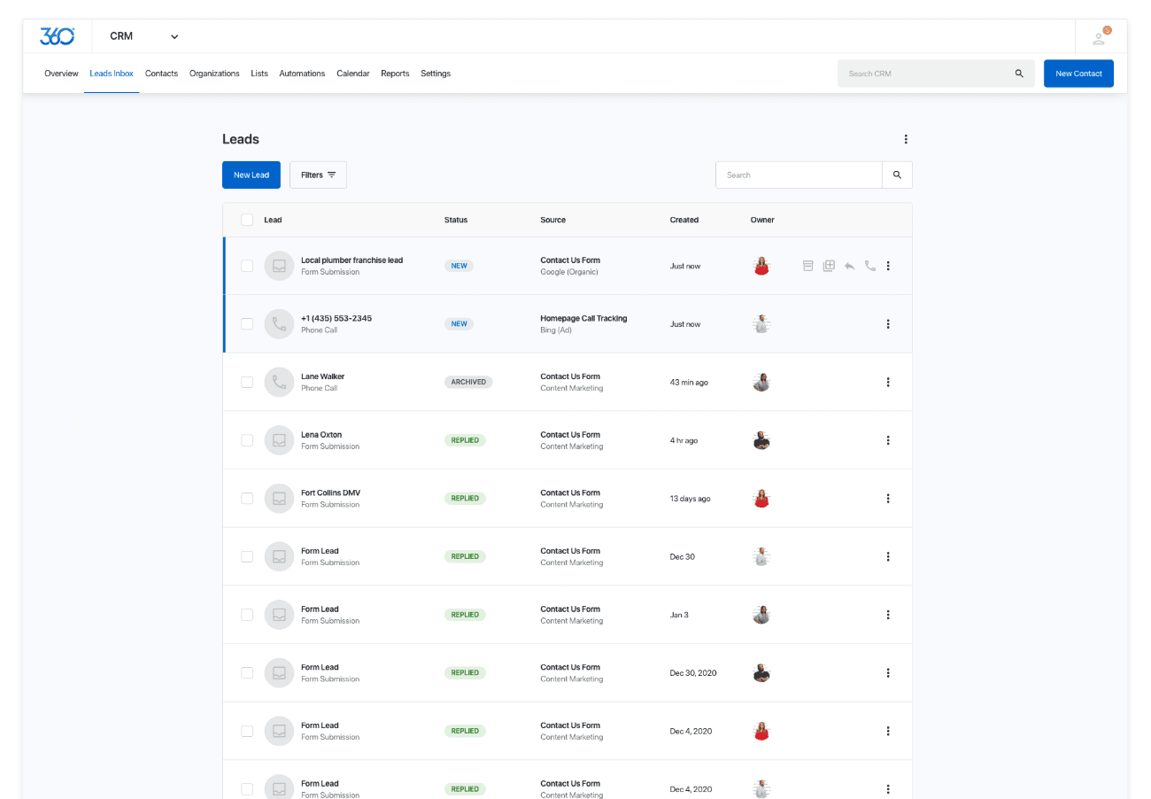
The Marketing 360® leads inbox consolidated potential customers into a single list. The problem is that it lived in a completely separate product from the CRM. This meant users would have to go between two different products constantly when they were managing current and potential customers.
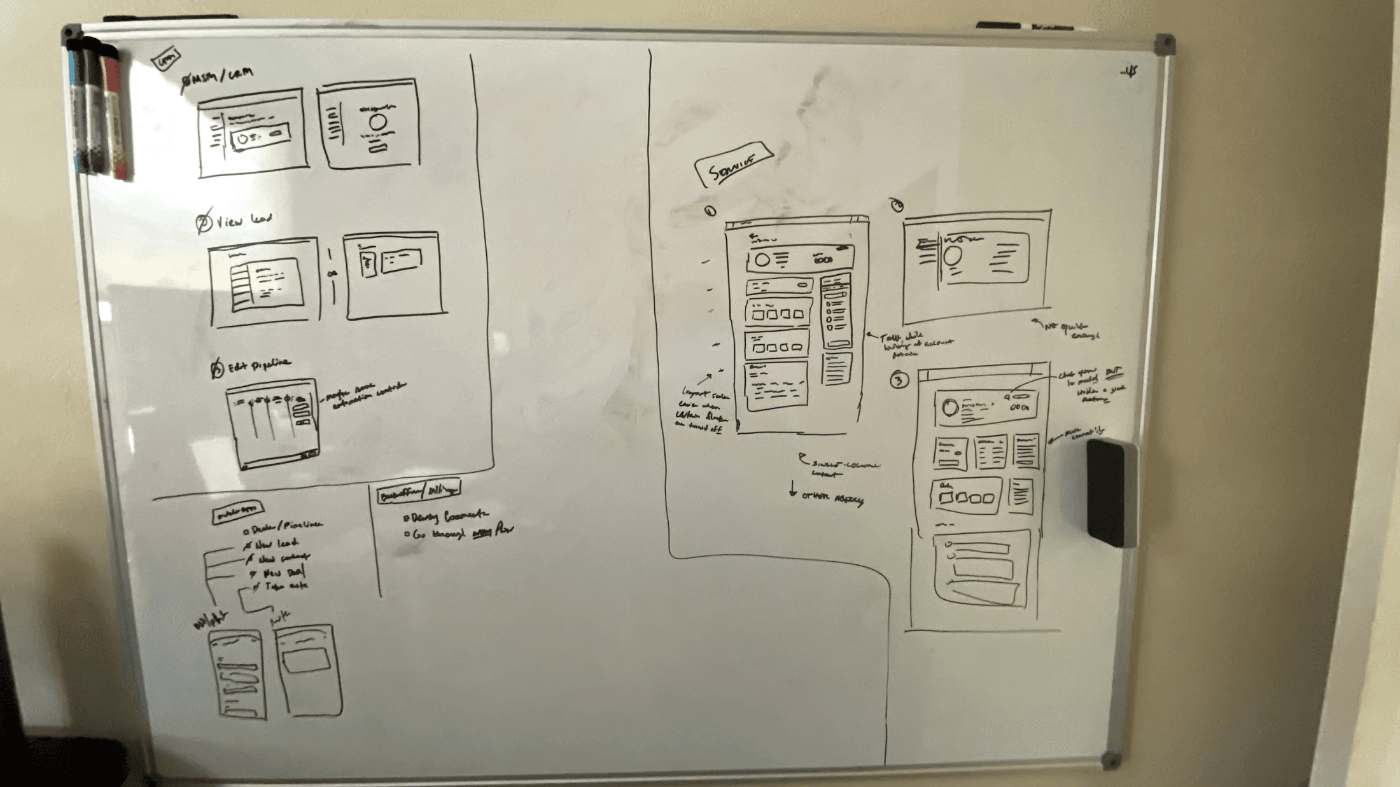
Low-fidelity sketches of a new, more efficient lead management flow.
We tried a number of solutions to solve for this, but ultimately landed on migrating the leads feature completely into the CRM instead.
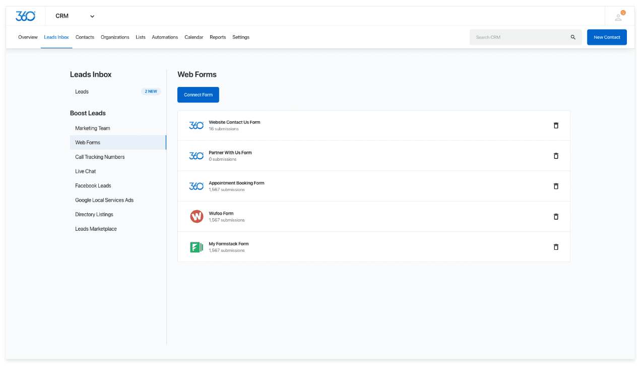
A new "leads inbox" tab was added to the CRM.
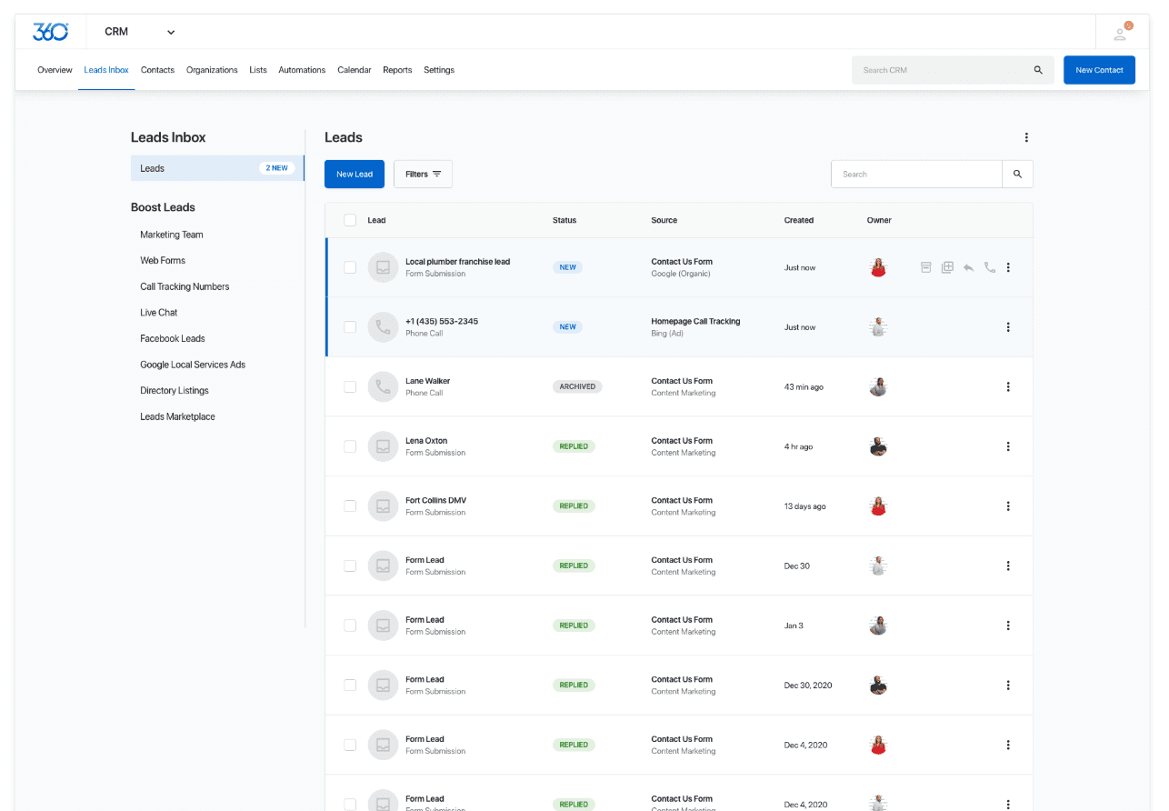
During testing, we also realized that our customers were not fully aware of all the ways that Marketing 360 can help them generate leads. We explored a direction where these options were more visible on the page. This solution more tightly integrated the "marketing" wing of the platform which was a great cross-sell opportunity for the business.
A later iteration showcased tools for SMBs to get more leads right in the inbox.A list of web forms that a user has previously created with a button to create more.
Customers also appreciated the easy access to all their top-of-funnel tools.
Throughout this process, we followed a regimen of usability tests and user acceptance tests after each iteration reached staging. This kept us nimble and let us confirm at each step that our changes meaningfully improved lead management and, in turn, the CRM.
Integrating payments into the CRM
Since the Payments product was an entirely different tool in the platform, customers historically had to exit the CRM and switch to that tool to transact. This was a clear point of friction that we wanted to address.
Working with our engineering counterparts, we found a way of unifying customer records across the different products and cross-sharing the data between them such that the CRM would now display historical transactional data while also allowing for a payment flow right from the CRM customer record itself.
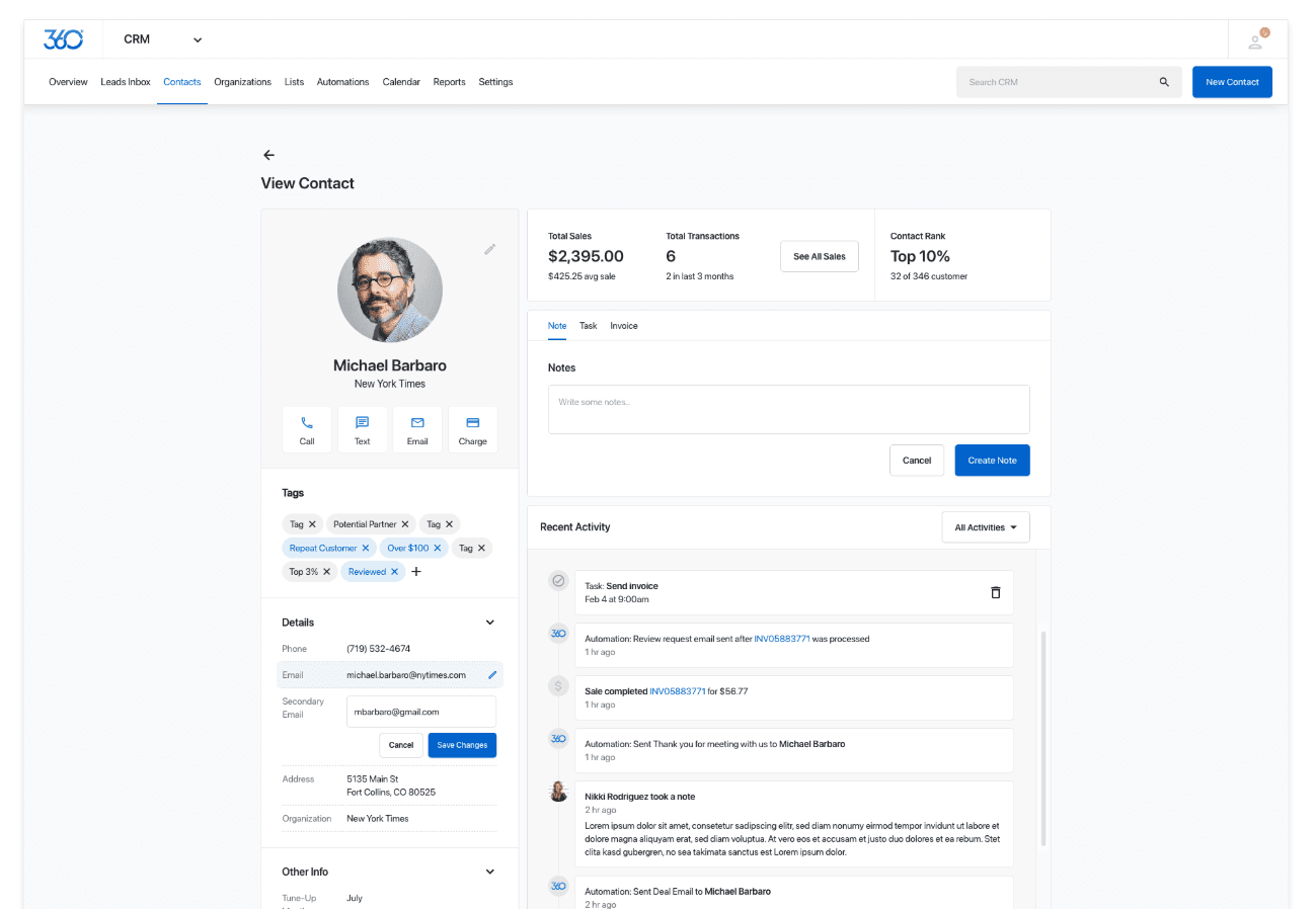
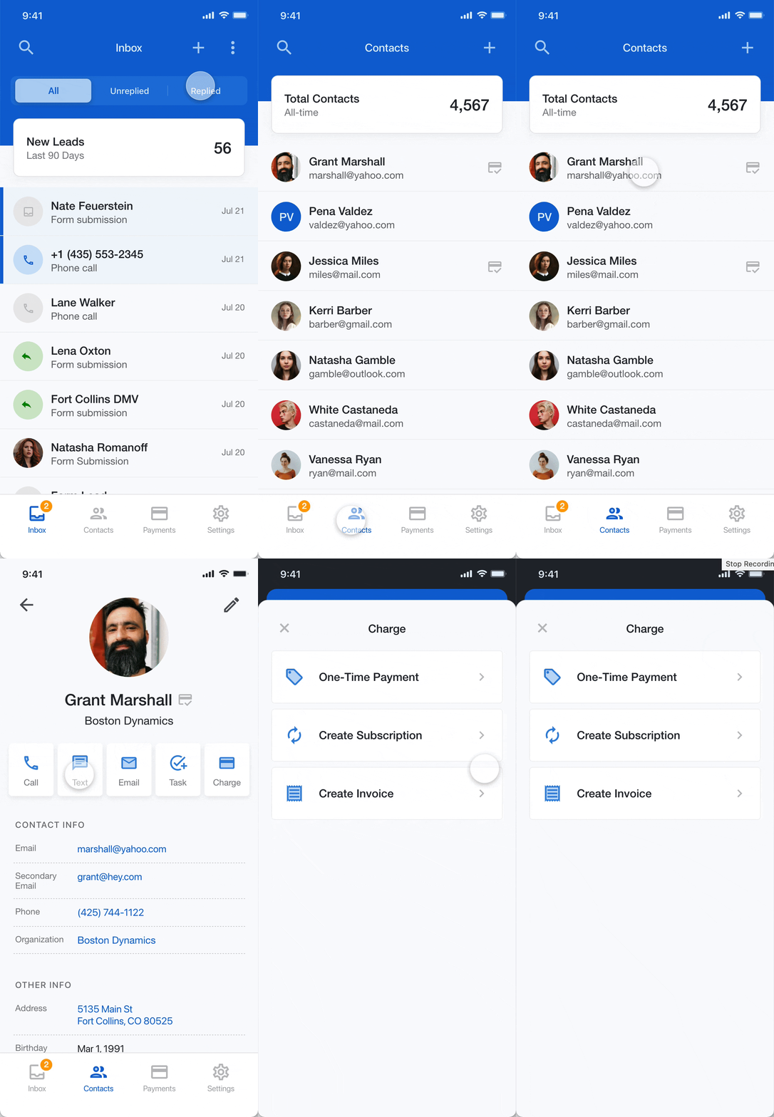
The new designs reworked the contact view to make room for key actions (seen below the contact name). The key thing to highlight here is the ability to "charge" right from the contact view in the CRM. Additionally, contact transactional history would now be integrated rather than having a separate record in the Payments application.
Revamping the payments dashboard
I also spent a lot of time with our internal support teams, where we uncovered a treasure trove of insights around what our customers have been asking for. Some of the more frequently mentioned items were: better reporting, an activity list, and a faster way to get into the payment flow.
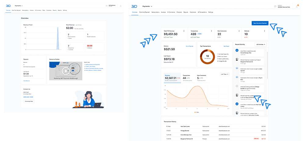
Comparing the old (left) Payments app dashboard with the new (right).
Collectively, the improvements we've made to the leads, CRM, and Payments workflows amounted to a 30% increase in GMV.
Extending the reach via a mobile app
The project drove a lot of new accounts to use the CRM and Payments products, and businesses who had previously used it showed a bump in their total transaction value as a whole.
This was great, but it still left out a critical segment of SMBs: Contractors, mobile merchants, and anyone else who needed to manage their business efficiently on the go. Our hypothesis was that serving this market would amplify the gains we'd seen from the web app improvements.
We pitched this to leadership, and they gave us the resources to explore it.
“Most of our techs don't even have an iPad when they go on the job.
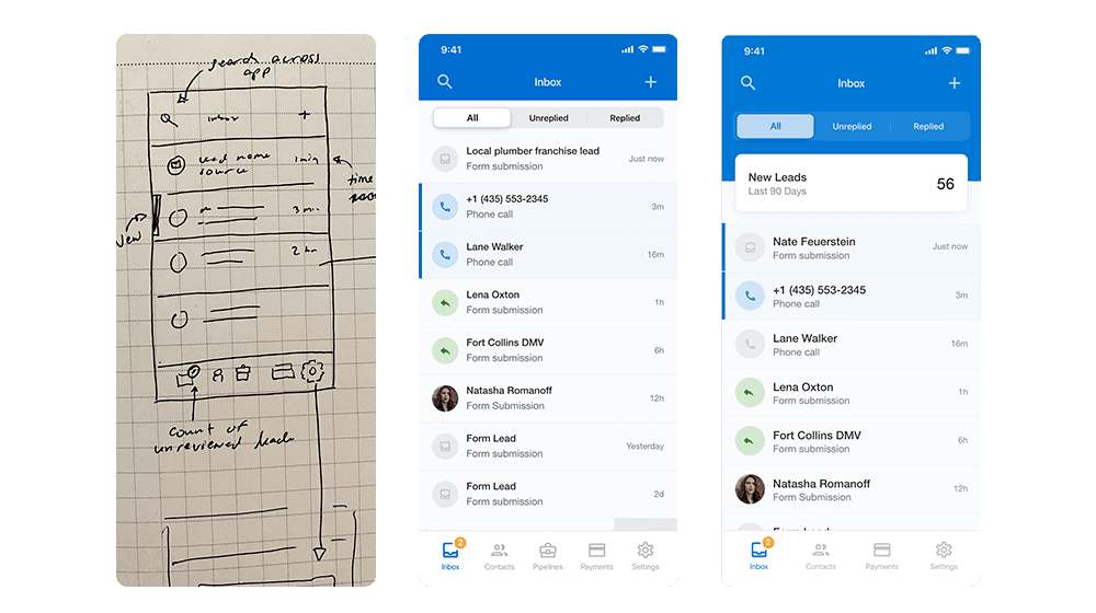
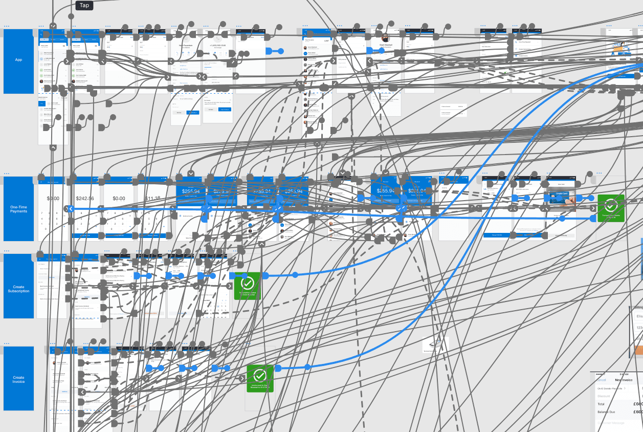
From wireframes, to initial concepts, to later designs.Our prototypes included all key interactions to provide accurate testing.
To validate our hypothesis, we showed the prototype to customers who matched the target segment but who also already had some familiarity with the Payments product. As we got positive signals on some of the key flows, we kept the leadership team in the loop and continued fleshing out more and more of what would become the MVP.
Every single interaction was prototyped and tested multiple times to make sure that we were on the right track.
Our design process always brought engineering in up front, so basic functionality was wired up well before final designs. We agreed on the flows and surfaces early, then refined the details as we went.
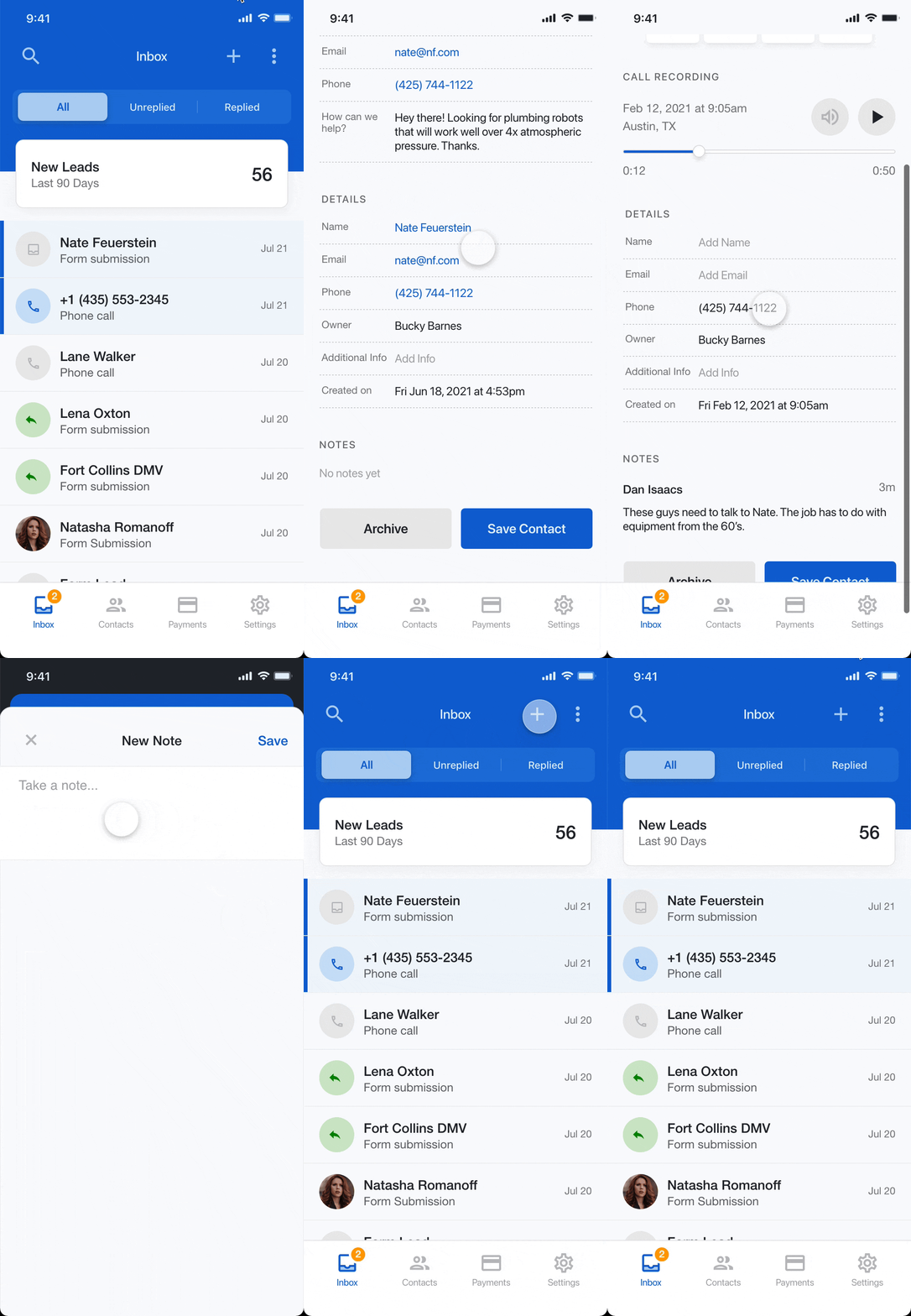
Accessing and managing leads.Taking actions on a customer.
I assisted in the go-to-market by working with the marketing team to develop messaging, assets, and campaigns around the new mobile app.
As of 2025, the mobile app has a 4.3-star rating on the App Store and processes millions of dollars of transactions every month.
Establishing a design system and the ops around it
I led the creation of a design system while we were building these features. I worked with every member of the 4-person design team to train and build a process around how to contribute to it.
Of course, a design system is no good without the engineering chops to back it up. I formed a great relationship with our lead frontend engineer and we collaborated frequently to ensure that the system is efficient, consistent, and is actually driving value.
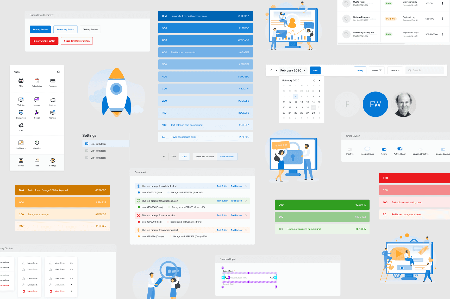
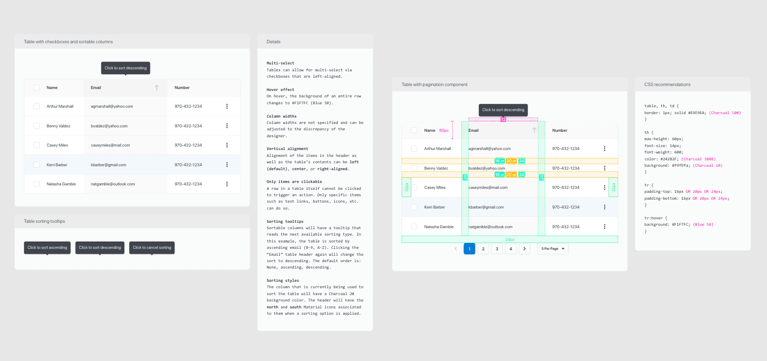
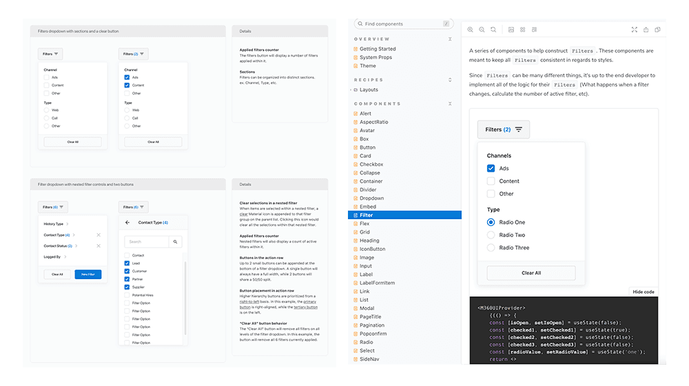
A sample of the components, illustrations, and guides in our design system.Components included usage and development documentation.The Filter component in our design system and in the component library (Storybook).
Impact
Throughout the 6–9 month process, we steadily drove improvements to our target metric. This culminated in a 30% improvement to GMV (or millions of dollars of transactions every month), which correlated directly with product stickiness, since more businesses were using our platform to run their business.
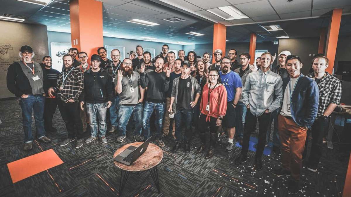
The Marketing 360® development teamMarketing 360 dashboard concept leveraging the design system that we created.
Meanwhile, our satisfaction metrics also steadily climbed. As the design system matured throughout the process, the product also noticeably became more polished. This benefit comes in addition to the faster velocity that was enabled by the component library.
This case study exemplifies the value of design and tight cross-functional collaboration in driving results for customers and for the business.
Designed a new, lightweight EMR focused on enabling clinicians to support patients in their own homes.
At a glance
Led end-to-end design for an EMR for acute and longitudinal care.
Clinicians preferred the new solution and were able to get their work done faster.
Created a new design system in partnership with frontend leads, expanding on Google's Material Design.
Overview
When feeling unwell, perhaps the last thing people want to do is to go out. If you need in-person care, however, then how would you get it?
DispatchHealth is a $1.7B health tech startup that aims to bring urgent and longitudinal care to patients in the comfort of their own home.
The company has entire fleets of providers in many markets throughout the US and is steadily growing.
“They brought everything you would see in an emergency room, but the emergency room was our bedroom! They knew what they were doing.
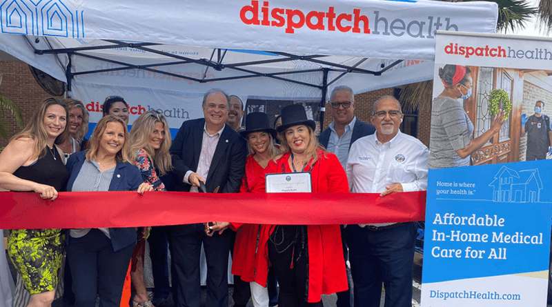
A DispatchHealth PA and RN duo.
Scope
To enable operations at this scale, custom tools for logistics, care delivery, booking, and more are required. I worked directly with the providers who go into patients' homes to create a new, lightweight EMR tailored for this new workflow.
Discovery + planning
The six-month project began with the in-house product team, identifying where we could have the most impact. We worked directly with the providers who were delivering care — joining in on ride-alongs, conducting interviews, and forming relationships to build a true understanding of their moment-to-moment workflows in an effort to find the biggest opportunities for improvement.
The mandate from the business was to find ways to make care delivery more efficient without sacrificing the quality of our service.
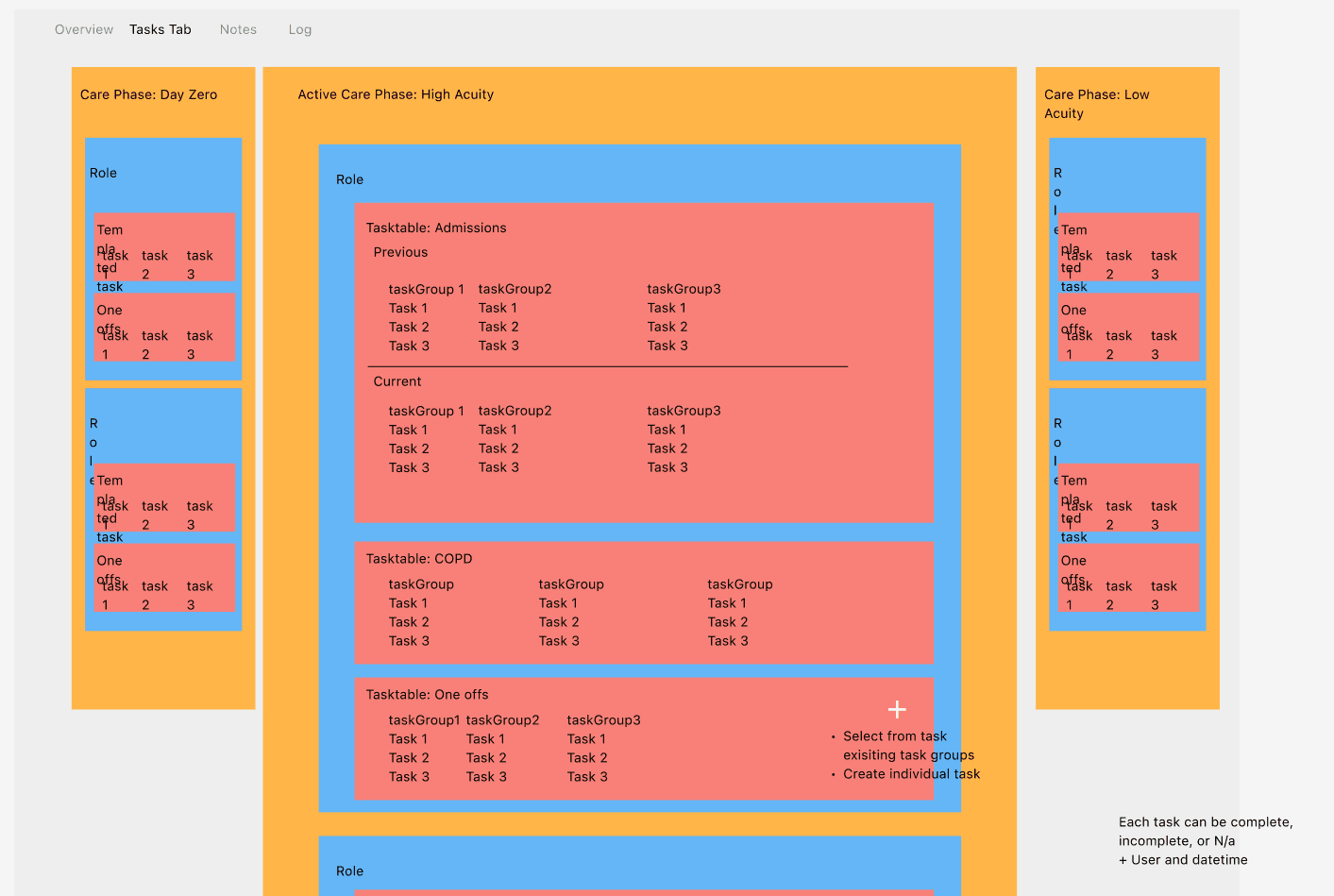
Breaking down the types of care and the actions and data associated with each.
Working on healthcare tools added another layer of complexity. Each service had its own billing code, which varied by insurer and by state. This came with a lot of technical complexity, and thankfully, we partnered closely with our engineering counterparts to account for limitations early in the process.
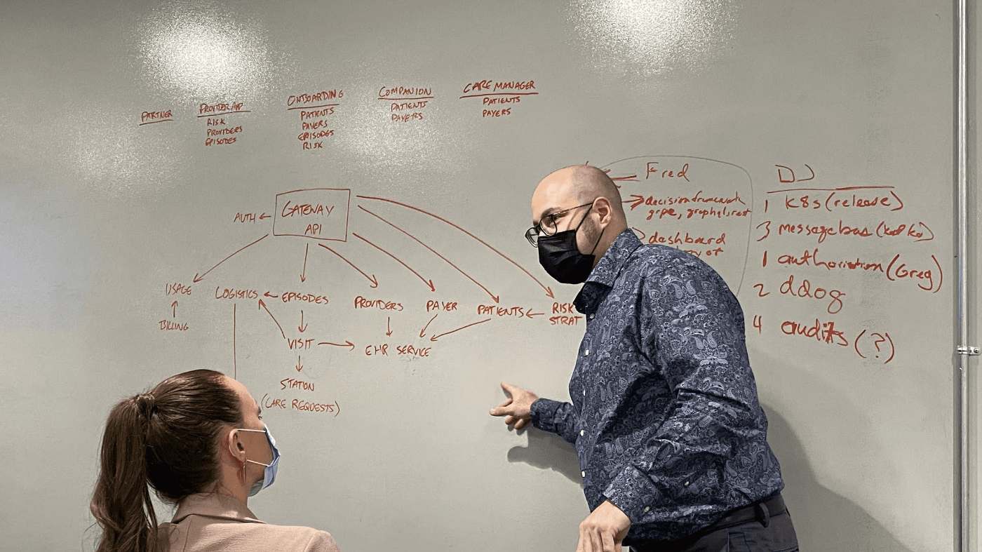
A product and engineering sync around the complexities of the digital infrastructure.
Key findings
Providers needed the EMR to "stay out of the way" while they are providing care. Rote data entry and unnecessary interactions with the interface needed to be cut to a minimum.
Providers needed a way to see their schedules far ahead of time, but the logistics engine that assigned patients refreshed in real time, so we needed a way to balance route planning with provider needs.
Providers quickly switched between patients during triage.
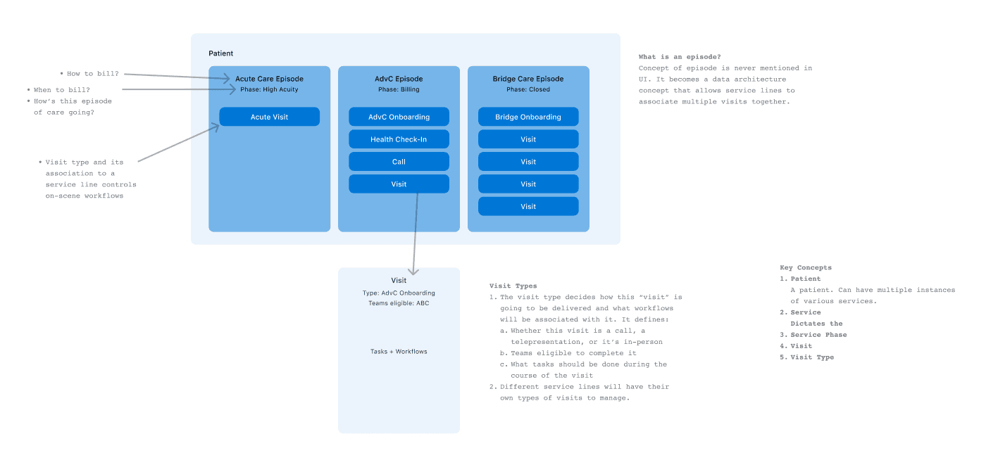
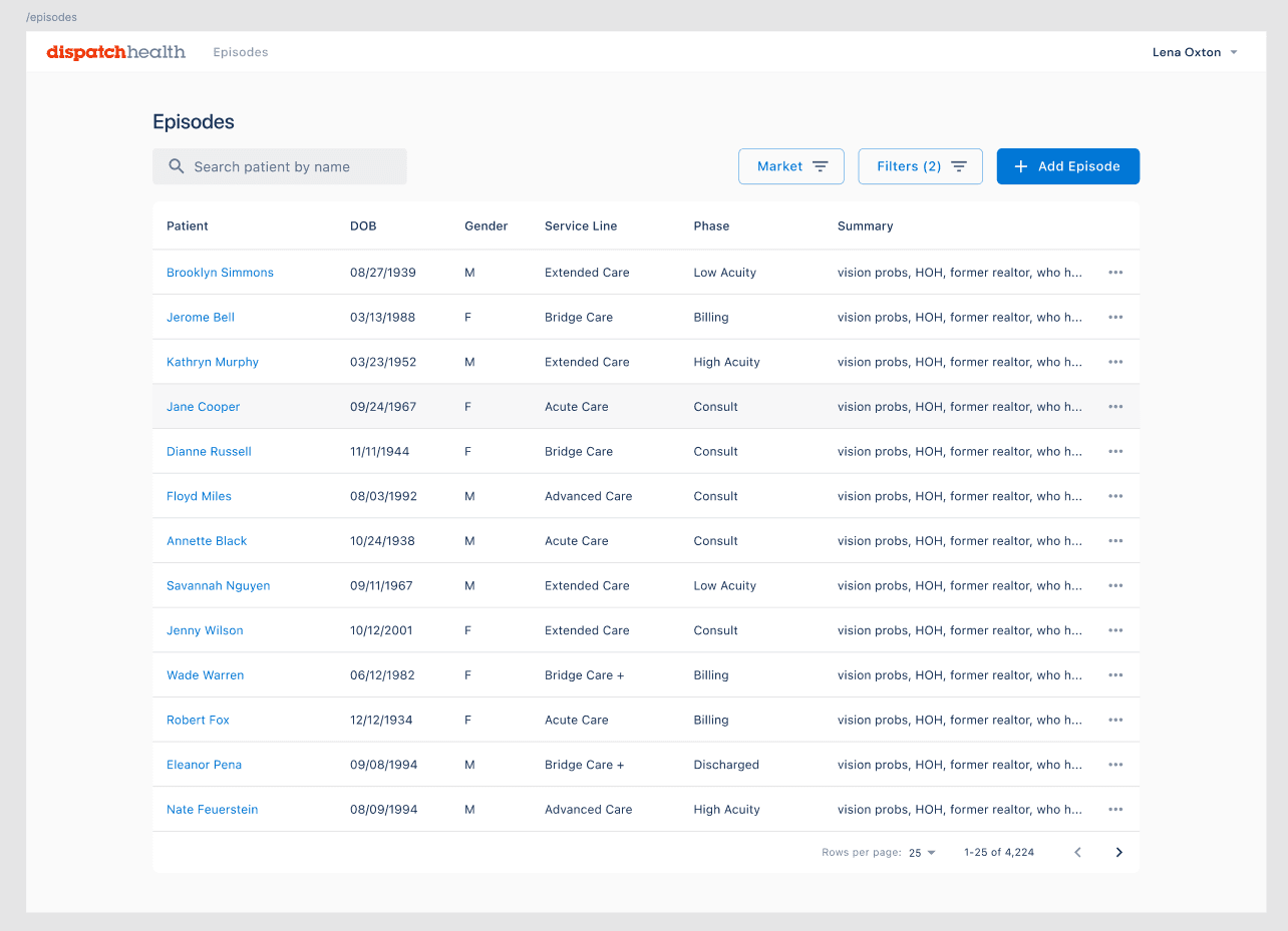
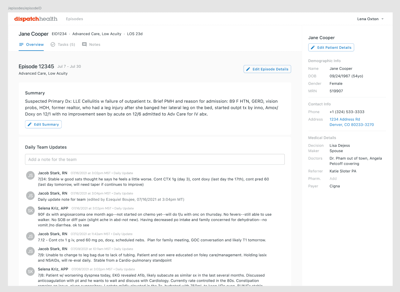
Some patients will be seen multiple times for the same "episode". Some visits needed to be grouped to allow for easier data access, reporting, and billing.
Most providers use iPads when they are in a patient's home.
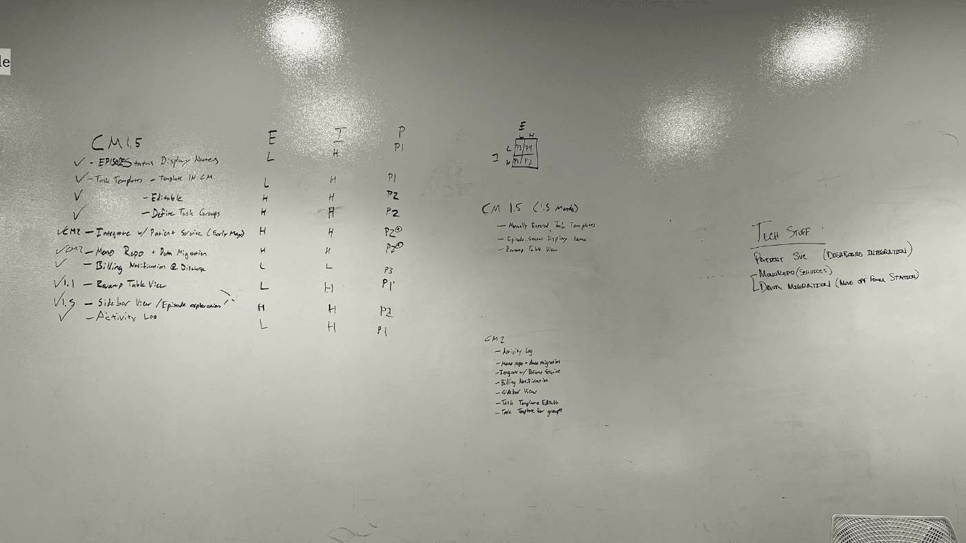
Whiteboard showing a prioritization draft for the new EMR.
Throughout the discovery and planning process, we regularly checked in with clinical partners to ensure that we were aligned.
Ruthless prioritization
Solving for everything would mean we would never get done. Throughout the planning process, we kept track of high-value items that would either be fast-follows or candidates for the initial build.
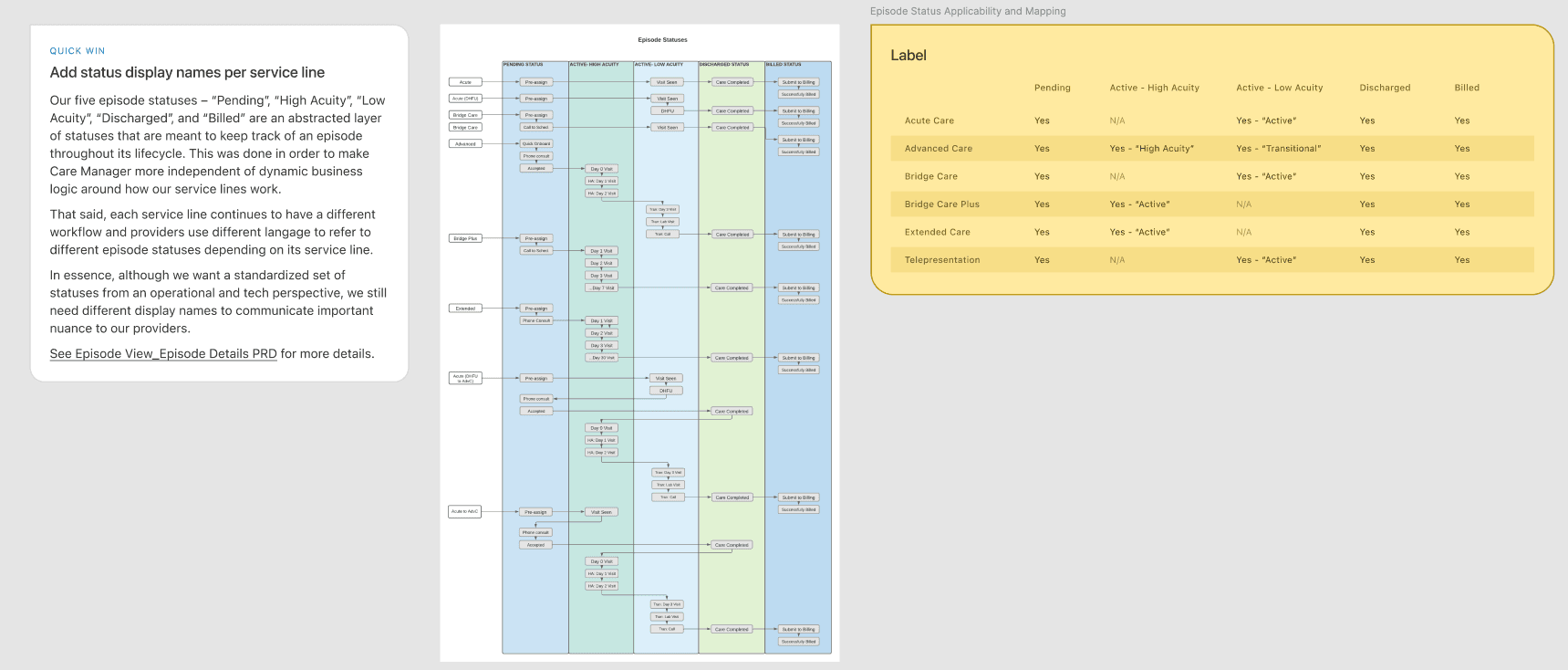
Breaking down services and how we can make them and their statuses understandable at a glance.
My role
I was the end-to-end designer for this project. I worked with product, engineering, and clinicians to take it from discovery to impact.
The new product we were building would be dubbed "Care Manager".
Development
What did the existing tools look like?
The software that took DispatchHealth from early startup to a $1.7B company was no longer scaling. It was bloated, difficult to understand, and hard to use (particularly when working with patients in their own homes).
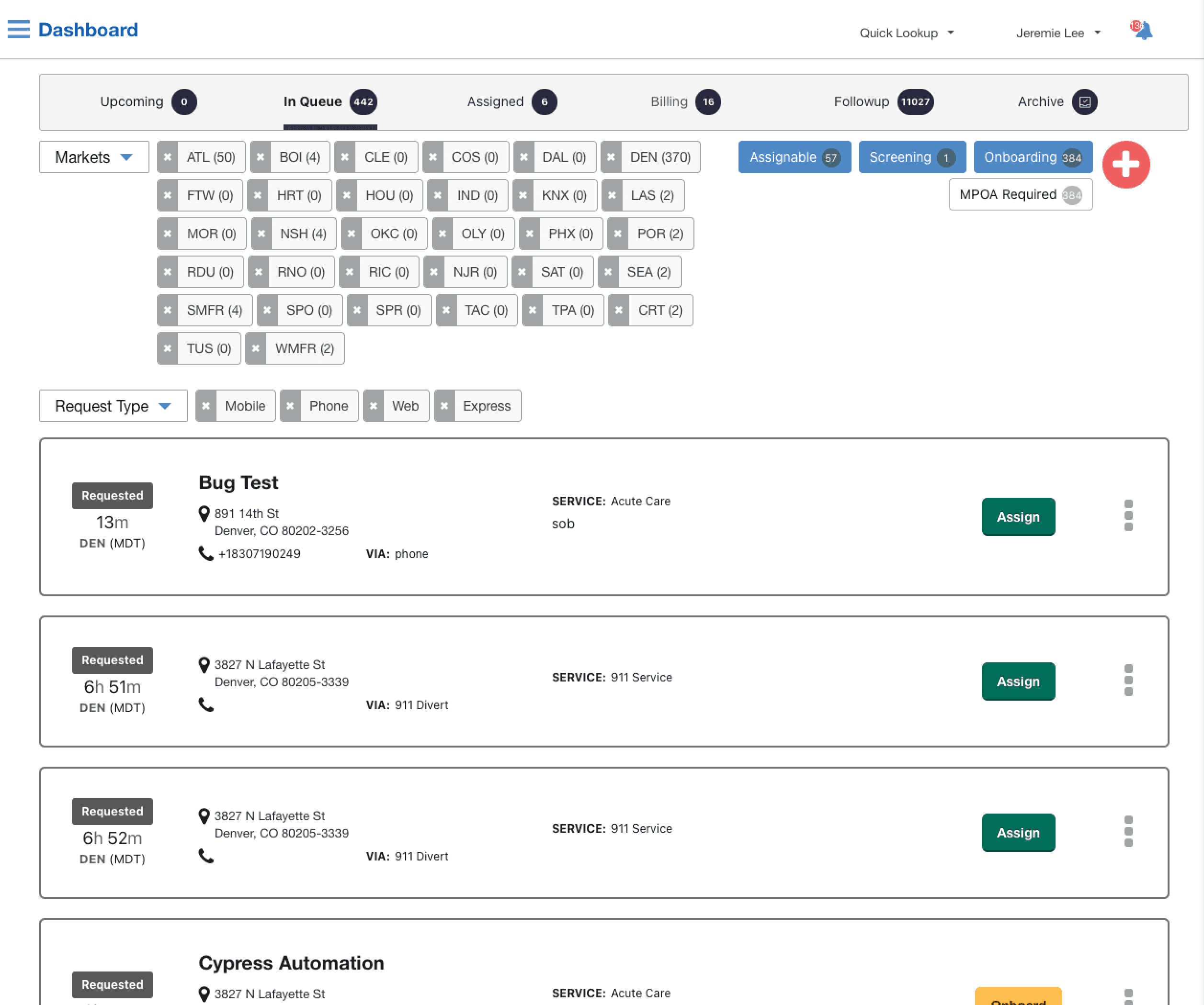
Screenshot of what clinicians were using at the time.
Early concepting
Clinical tools are complex. There's a lot of data. There are a lot of actions to take. Clinicians are opinionated. Healthcare regulations and practices mean a lot of hurdles to account for.
Much of our time went into improving the provider experience while meeting all of these requirements.
“The billing team will use the episode view to understand the insurer, the days spent in our care, and the discharge date in order to understand how to bill for this patient.
The earliest concepts were simple boxes in FigJam.Dozens of concepts went through rounds of review with the product and clinical teams.
Quick access to patient information
We needed to balance meeting the many requirements from clinical teams with what's feasible to build for an MVP. A list wasn't good enough. How might we allow for rapid cross-patient access?
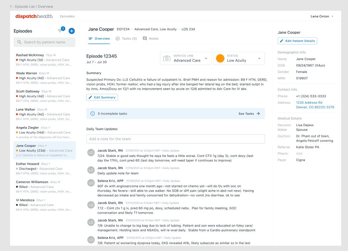
An early iteration of the list of patients was a simple list view — our goal was to get something simple out first and build upon it. But that quickly turned out to be insufficient.An early patient view. Clinicians would have to exit this page and select another patient if they wanted to see another. During testing, we learned that this left much to be desired.
“Triage is often freeform and we tend to talk about patient A, then B, then back to A, then C.
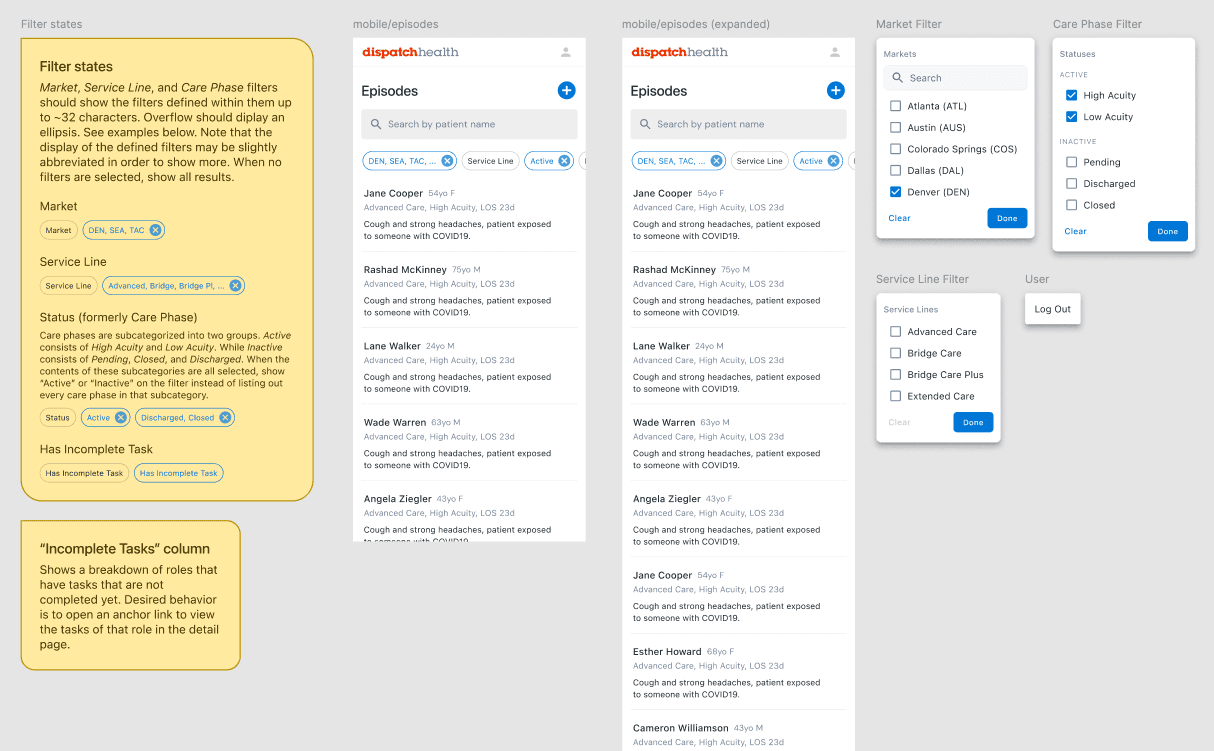
Early draft of a patient view that allows providers to quickly access other patients via a persistent sidebar on the left.
Establishing a design system
When I joined the project, DispatchHealth did not have a design system. It was built alongside Care Manager in partnership with a lead frontend engineer and the other designers in the company. I was the lead contributor on the design side.
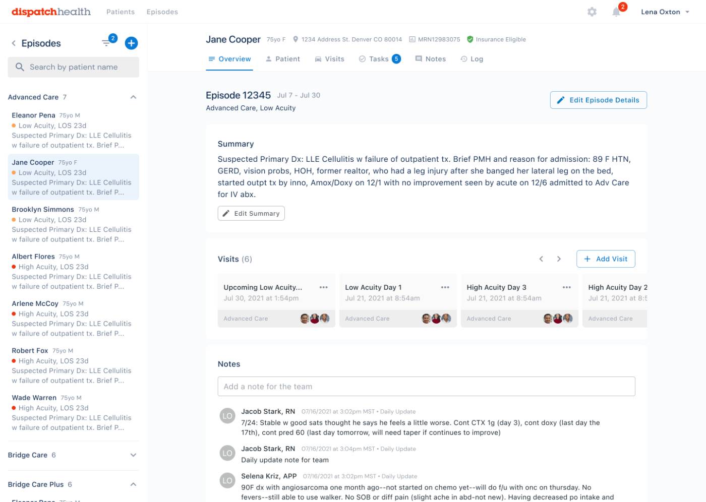
The MVP patient view allowed for quick access between patients, provided key information at a glance, and made the available actions very clear — as evidenced by our testing with actual providers.
We extended Google's Material Design, which was a joint decision made by design and engineering to speed up development (as opposed to making something completely custom).
Opening up new ways of working
A bonus goal for development and design was to make Care Manager much more usable on mobile devices, which was a limitation that we heard from providers. Although most used an iPad, the flexibility of being able to use their phones, especially since they were on the go, was key.
Mobile views and filtering patterns.
Impact
During our alpha, clinicians were excited about the new tool. They found Care Manager faster, easier to use, more accessible, and more enjoyable. Providers also needed less training to use it.
DispatchHealth was opening in more and more cities as we developed Care Manager, which made its impact grow even more over time.
Subsequent ride-alongs showed a material difference in how providers were interacting with the app, showing a reduction of time spent on screen, which meant more time with patients.
Saving a few minutes per visit, per provider, across every city we served added up to a significant gain.
Led the build of a mobile app to increase customer lifetime value and conversion rates for a national fitness brand.
At a glance
Mobile app features include:
Schedule and manage upcoming in-studio workouts
Review historical fitness data captured by proprietary workout machines
Basic nutrition tracking and coaching
4.1 rating on the App Store
Boosted CSAT and retention rates
Context
For many, finding time to stay fit is a challenge. Beyond that, knowing what to work on and how is hard without research or prior experience.
What is The Perfect Workout™?
The Perfect Workout is a national fitness brand that guides its customers through 20-minute slow-motion strength training. The company has studios in most states and has had around 70,000 members.
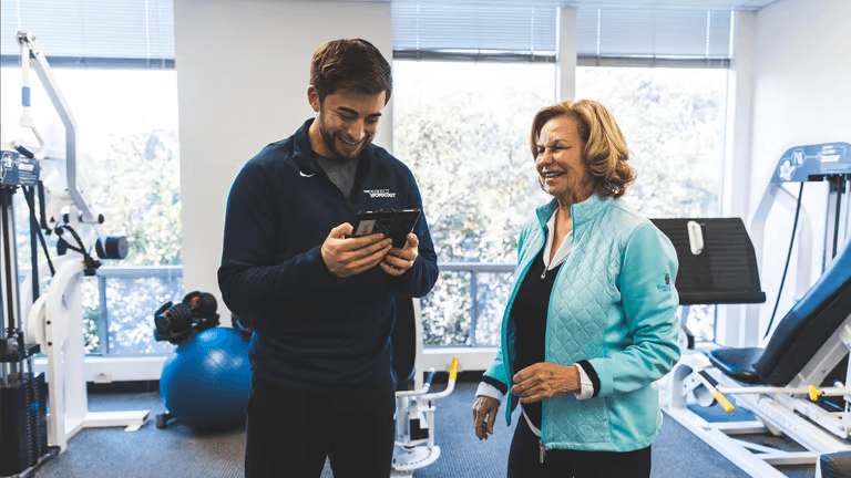
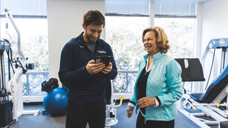
A customer and trainer at one of The Perfect Workout's studios.
“We started seeing results pretty quickly. Friends and family started noticing the changes, and we felt healthier and more energetic than ever.
Scope
I worked directly with their executive leadership team to design a mobile app for their members with the goal of increasing stickiness, customer satisfaction, and lifetime value.
Discovery + planning
The business's long-term goals and customer feedback drove our research. Studio trainers also had critical requirements based on their experience working in person with customers.
We held many planning meetings reviewing existing feedback and collected real-time information from customer interviews.
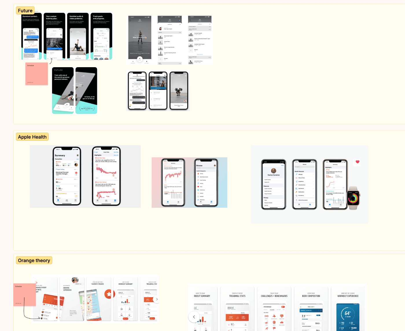
We also studied solutions in the market to inform our strategy.
A snippet from our competitor research board.
Key findings
Most of their customers were in the 40–65 age range and tended to be women.
Customers needed to be able to easily sign up for workouts and manage their appointments.
Customers are motivated by seeing their strength progress over time.
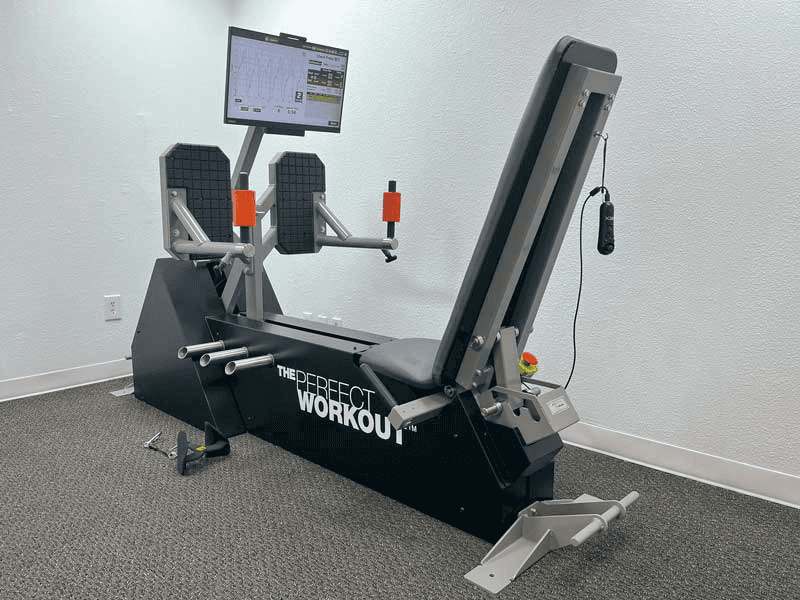
The Perfect Workout had their own custom equipment that tracked fitness data.
Since there are dedicated trainers for each workout, members received personalized nutrition education as well, but did not have an easy way to track or act upon their recommendations.
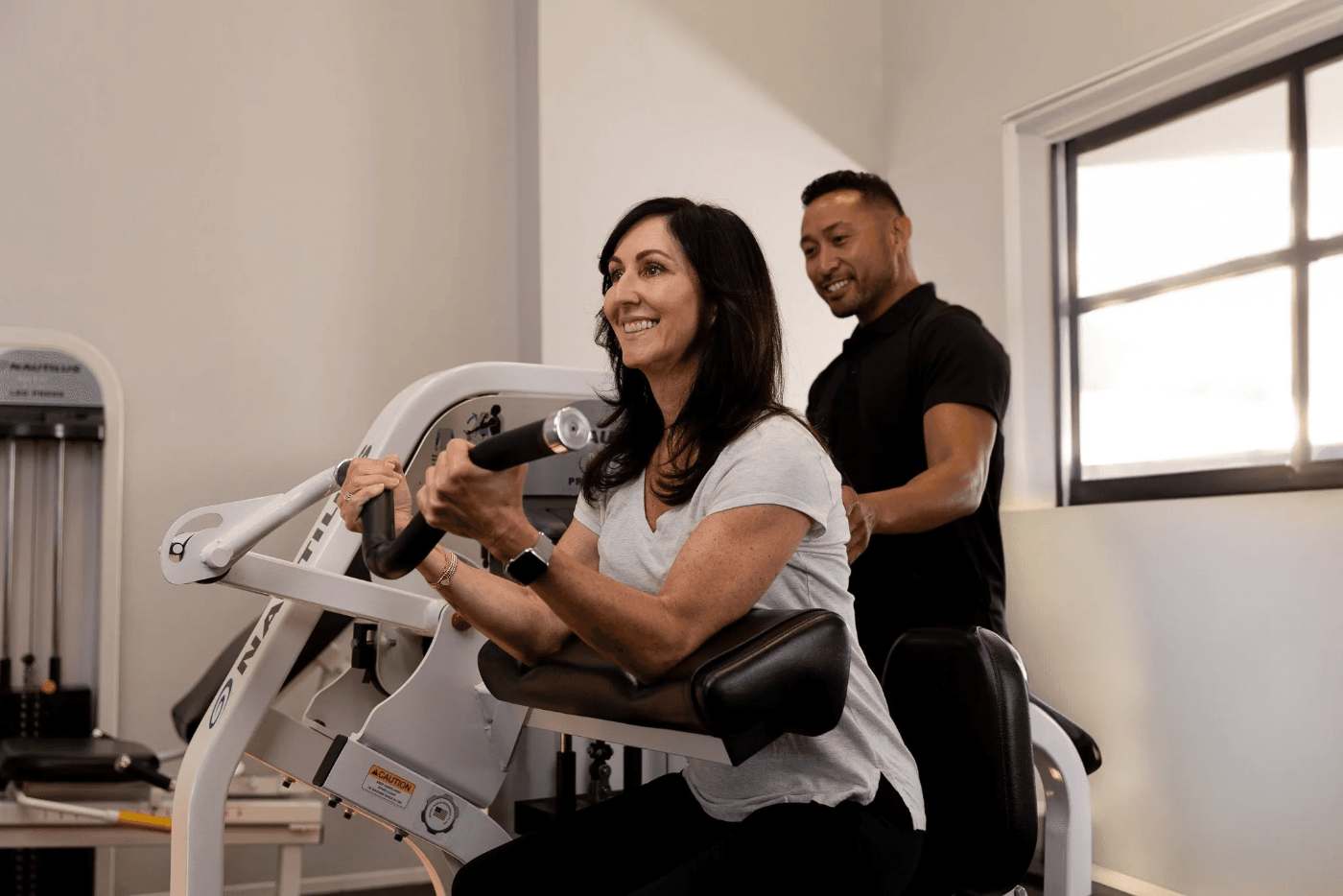
Custom workout equipment that was built for slow-motion strength training.
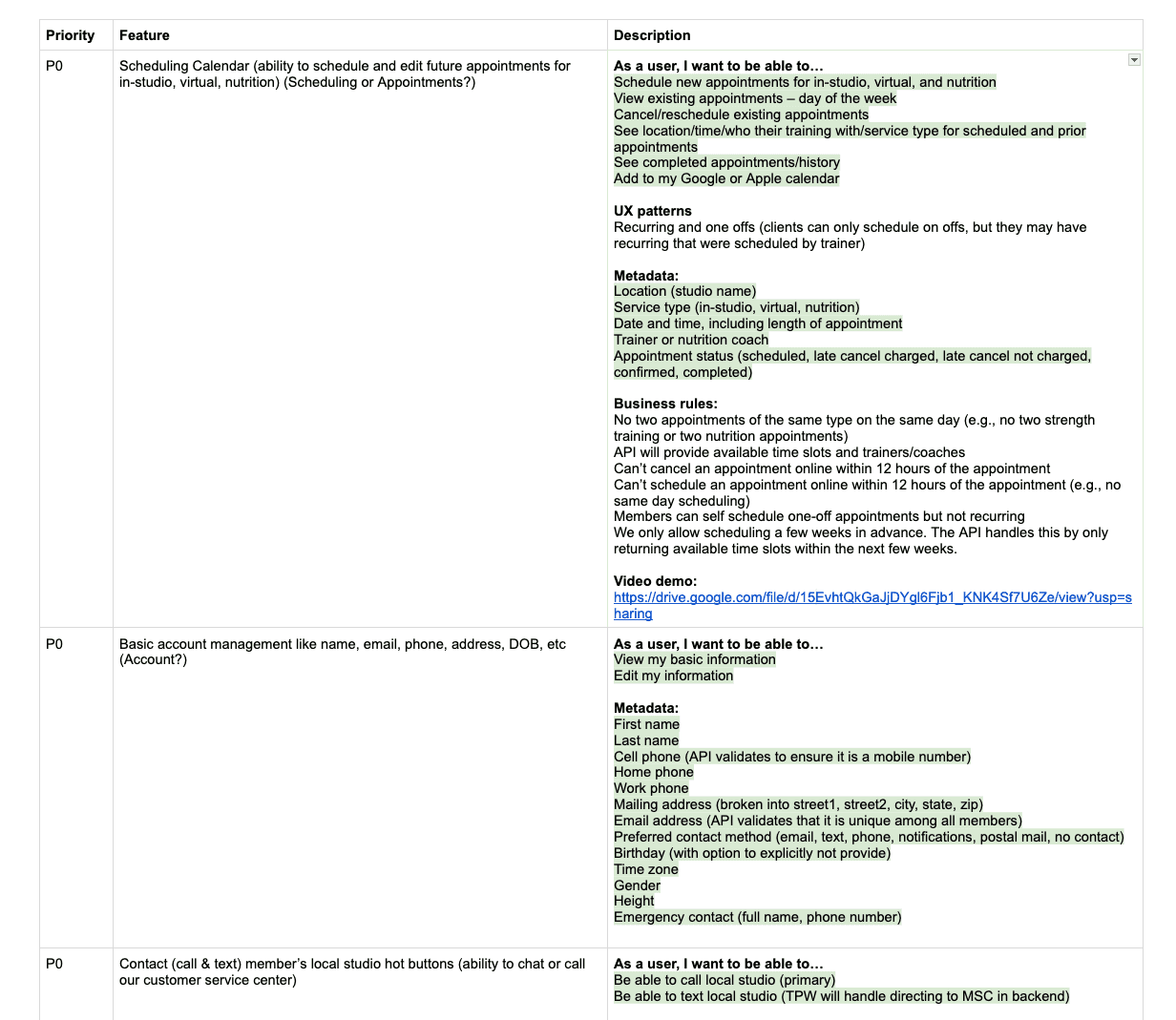
Given these parameters, I worked with the executive leadership team to provide product guidance on how to prioritize based on impact and scoping technically complex features. We planned to focus on basic but high-confidence functionality for the MVP.
A snippet of our initial planning documents as we prioritized based on customer and trainer feedback.
Once stakeholders validated the priority list, we moved to concepting.
Development
A new design system
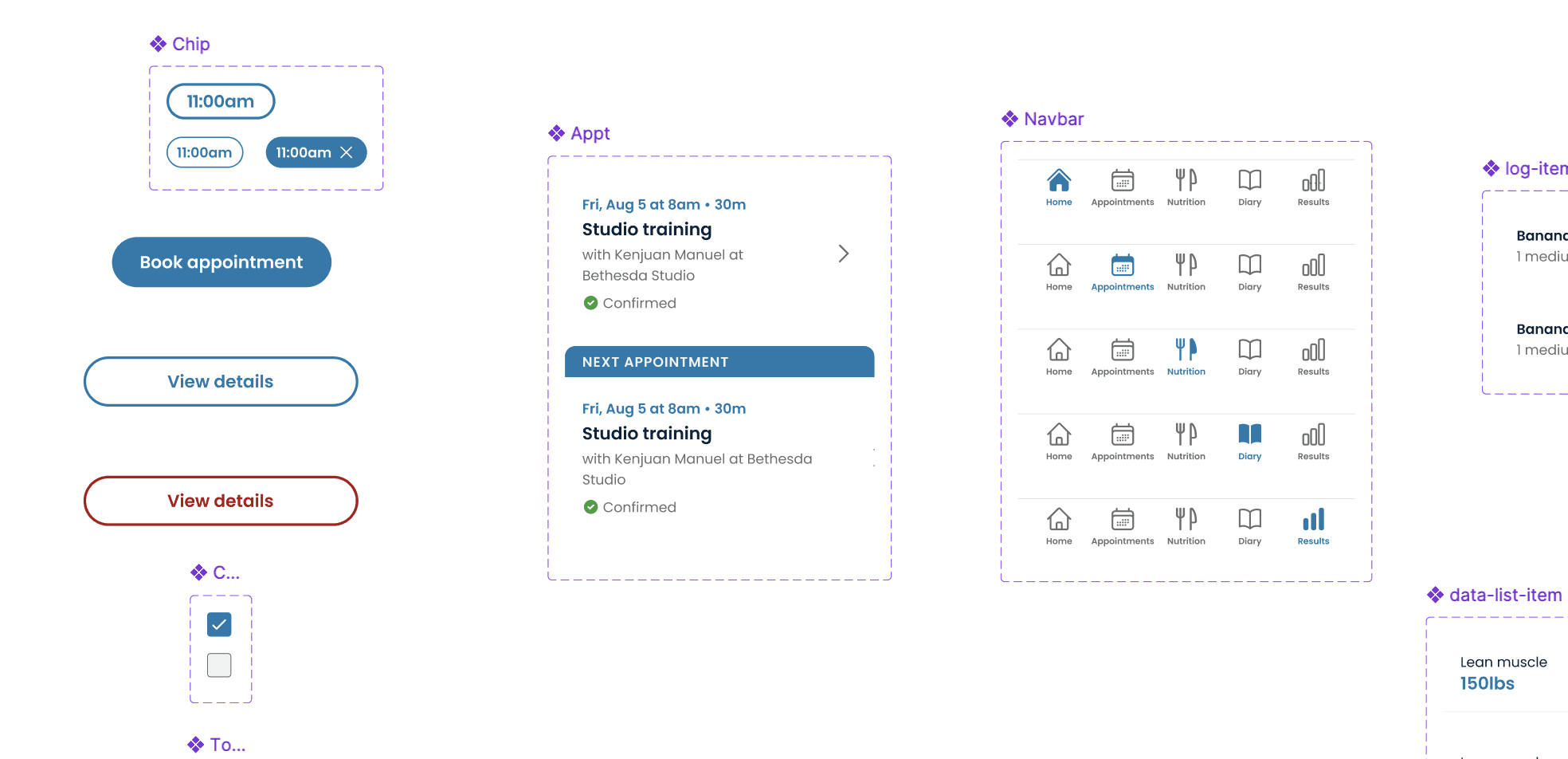
The studios were established and growing, but the digital product was new. In partnership with their marketing team, we created a new visual language for mobile, designed explicitly with their primary demographic in mind. This meant larger copy, simple flows, and clear actions.
Examples of new components designed specifically for the new mobile app.
Appointment booking and management
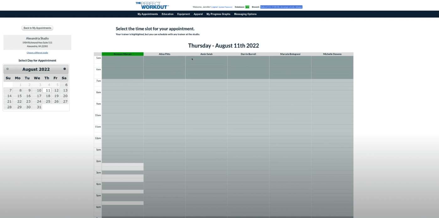
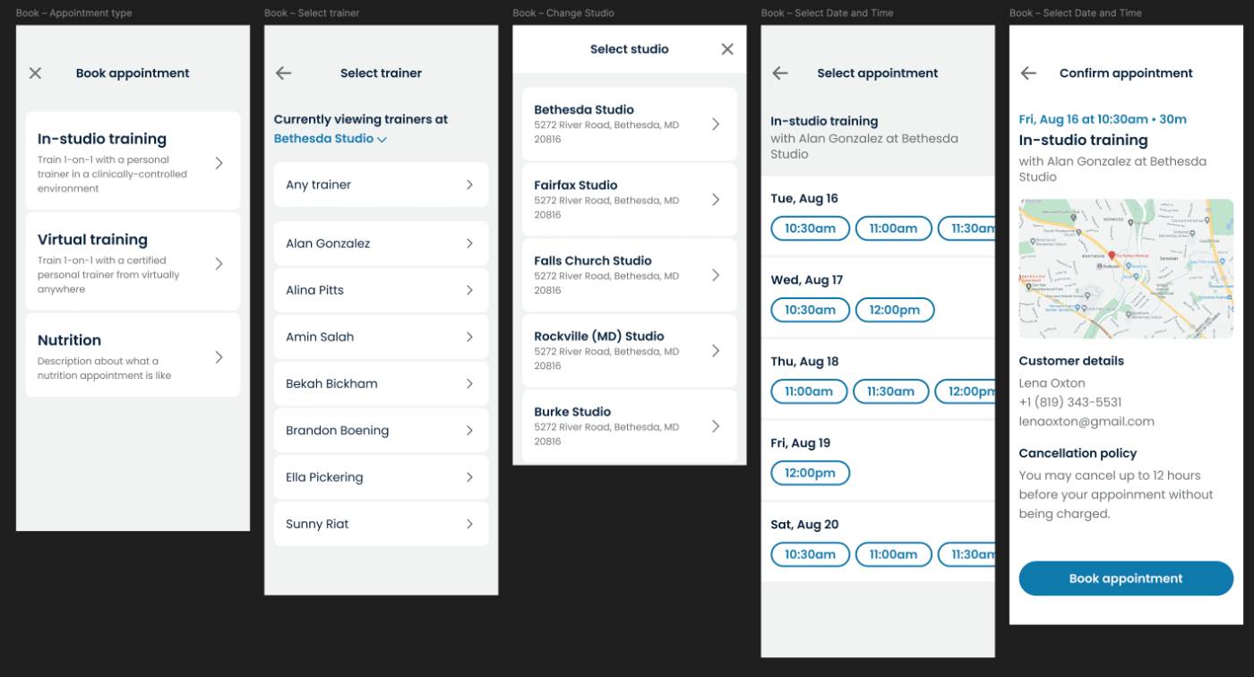
The existing solution for booking and appointment management wasn't very responsive and was difficult for customers to use. We set out to make this easier to use and available on the mobile app.
Existing appointment booking on web.New booking flow concept on mobile.
Progress tracking
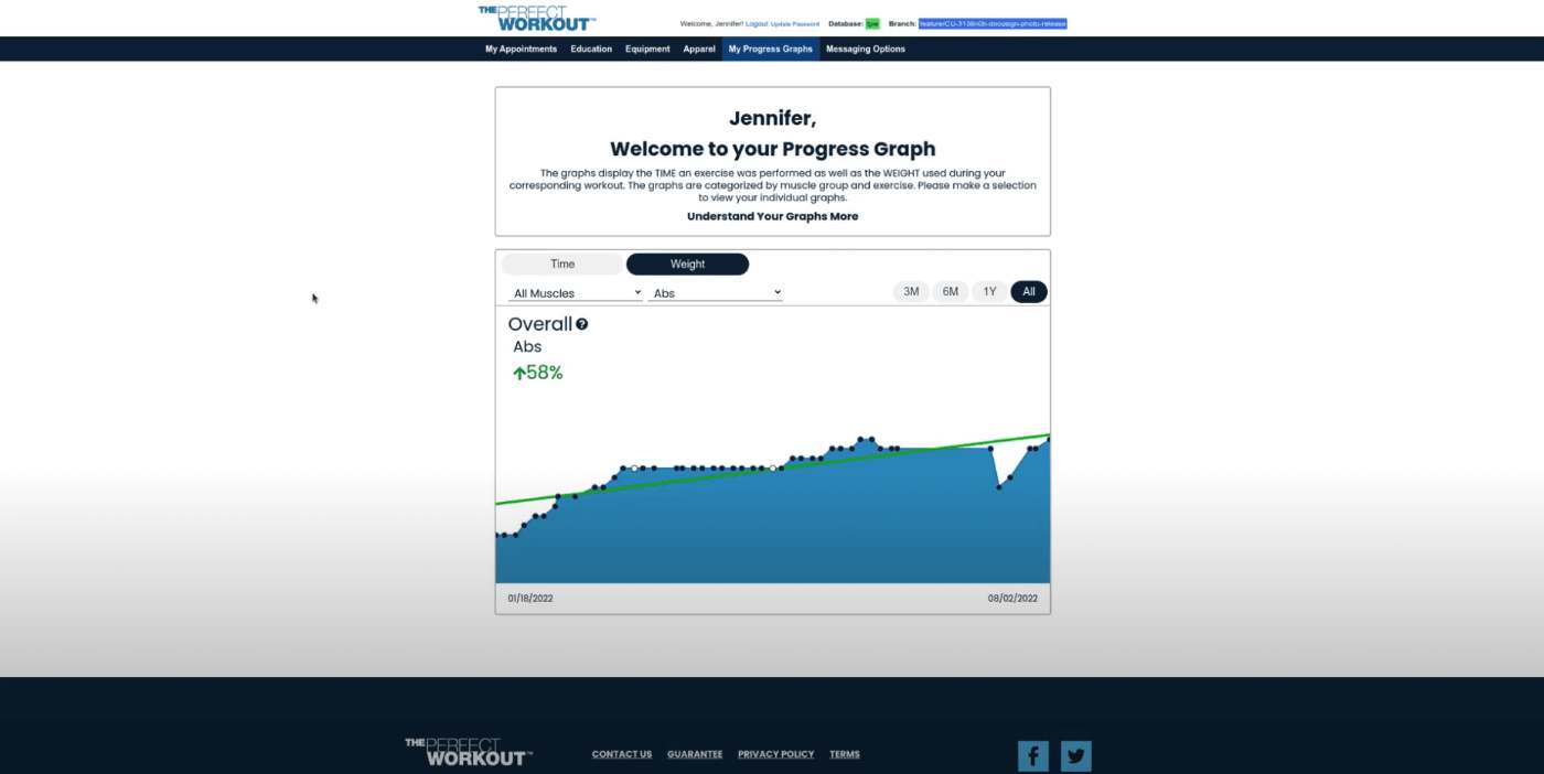
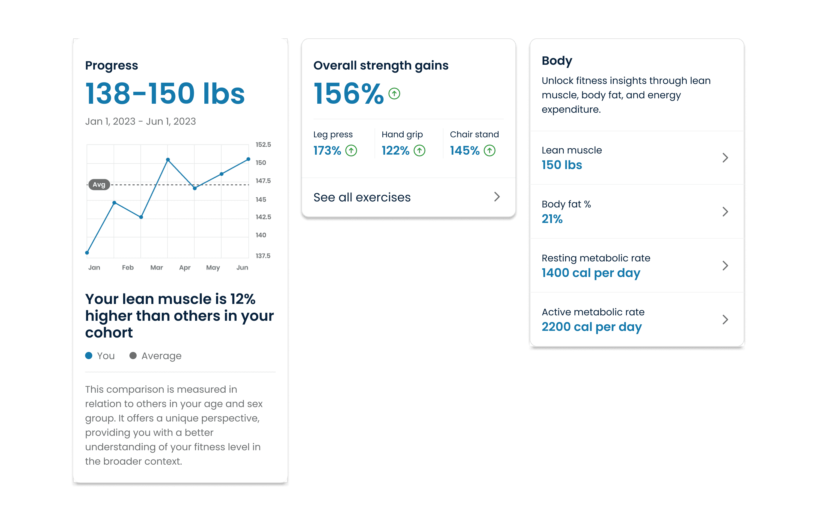
The studios' custom equipment recorded detailed fitness data for every client. One of the core requirements for the MVP was to take better advantage of this to further drive stickiness.
Seeing their progress also motivates customers to build a habit.
Existing fitness tracking on web.We created modules for data presentation that can adapt depending on the stat being shown. We also included ways of contextualizing what the data means to make it easier for customers to understand.
Nutrition
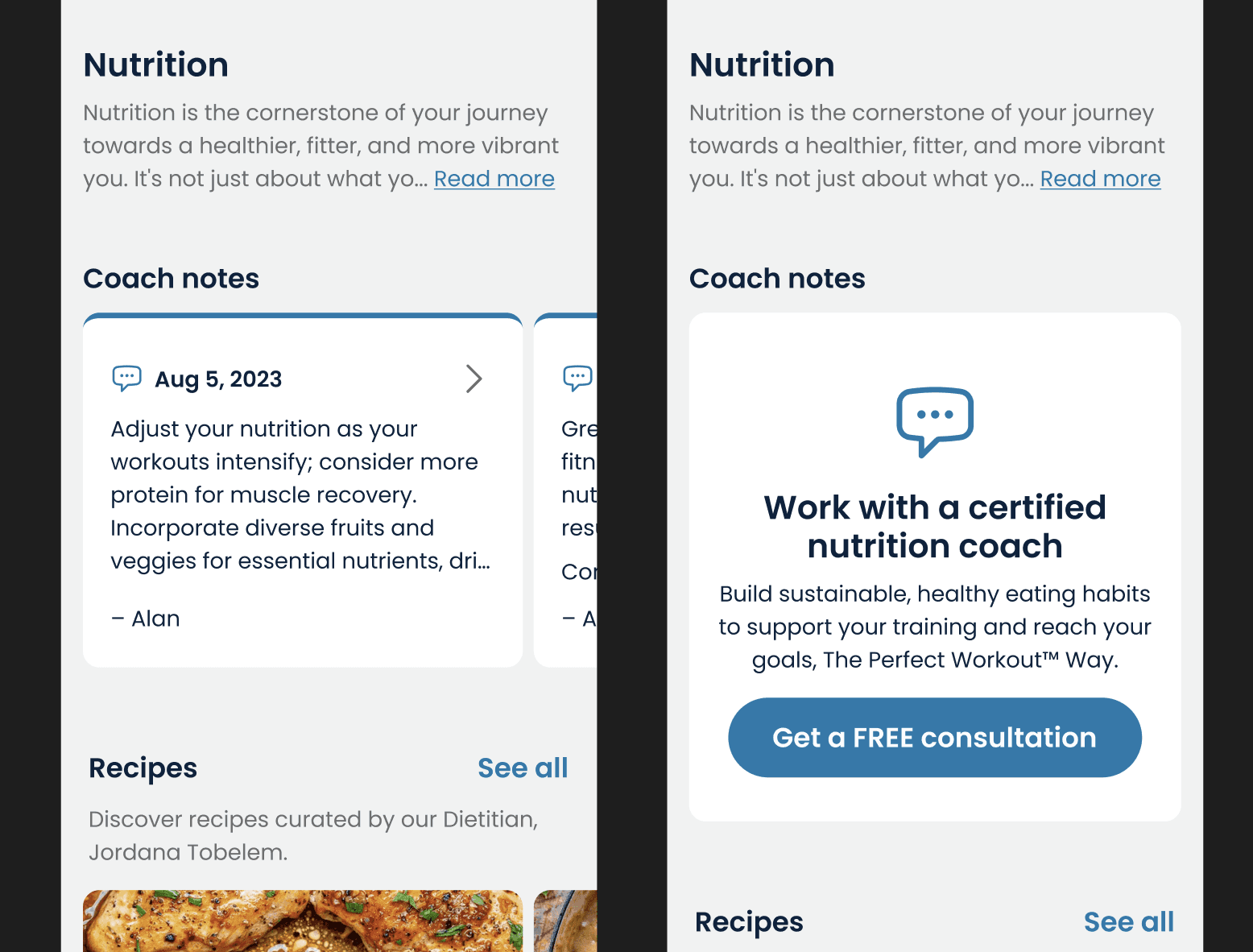
The third MVP pillar was making it easier for customers to act on the nutrition guidance their trainers gave them. Finding a way to do this in a lightweight manner took a few iterations, but we eventually landed on a simple log where customers can easily reference trainer guidance while keeping the ability to track their macros quickly and easily.
Coach notes allowed us to surface personalized guidance while keeping the scope small for the initial release.
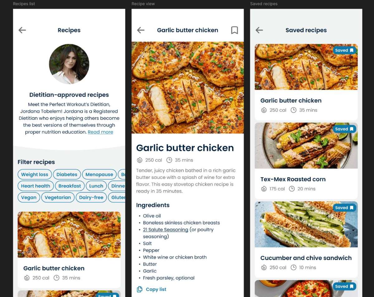
The Perfect Workout also had recipes developed by an in-house dietitian. We made it a goal to surface these to customers as well.
Flows that showcased the custom recipes developed by The Perfect Workout.
“People usually want to eat healthy but find it difficult to balance flavor and health. This is an easy win for us to include since the data is already there and customers are asking for it.
Impact
The app made booking and managing appointments easier, and customer satisfaction rose immediately. The improved progress tracking is positively associated with stickiness and the existence of the app in general has opened new ways to surface products to customers, which helped increase upsells and lifetime value.
Specific numbers are omitted for confidentiality.
“We applaud The Perfect Workout for personalizing our workouts for our own individual journeys
The initial launch was so successful that subsequent releases were quickly greenlit for further investment. I stepped away after the full release, but the app itself sits in the App Store with 4.1 stars.